Iván Gómez S. [PROFEIVAN] has produced an excellent video on YouTube demonstrating AxoTools’ Perspective panel. He has done other videos on AxoTools, which are all nicely done and clearly walk users through demo projects. Please check out the videos and support this channel on YouTube.
Note: The gear icon at the bottom brings up a menu to choose an audio track with English or Spanish.
AxoTools’ new Perspective grid has added a couple of new utility functions in a flyout menu.
Define 3-pt. grid
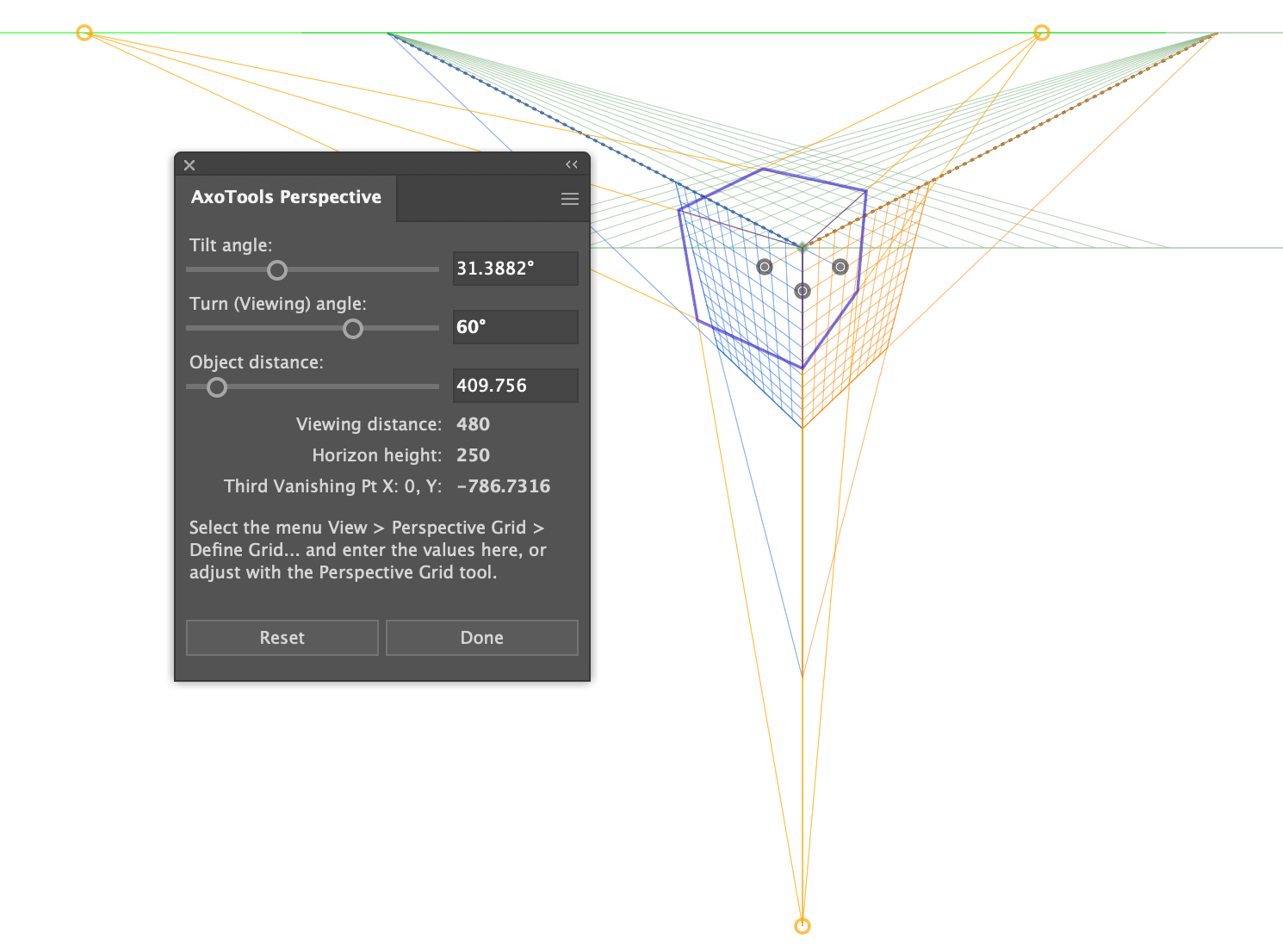
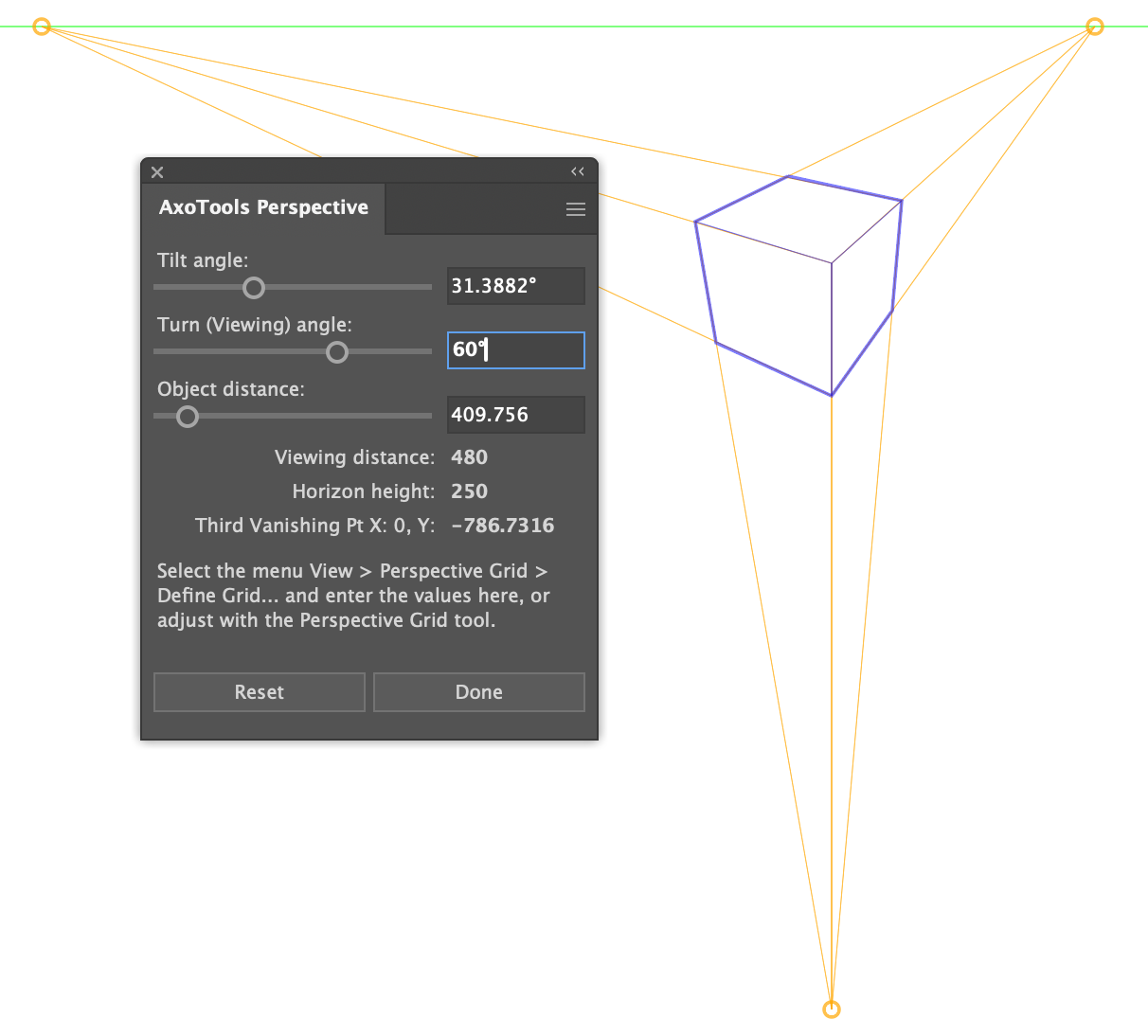
Defining a perspective grid in Adobe Illustrator has long been a bit of a puzzle. Illustrators have an idea of how we want our art oriented, but the fields in Adobe’s Define Perspective Grid dialog seem to have been geared to serve the software, not the user. AxoTools now makes that process a bit easier by offering a sort of visualizer for defining a three-point perspective.
Select “Define 3-pt. grid” from the flyout menu and the Perspective panel changes to show an alternate group of settings. You’re already familiar with the axonometric projection’s Tilt and Turn method of rotating your art, so this utility draws on that method. Rather than drawing a small proxy cube, however, the panel draws the cube and the lines to the vanishing points right on the artboard, aligned with your current perspective grid. You can hide the current grid (Shift-Ctrl/Cmd-I) to see your changes without distractions. Simply drag the sliders to change your top angle, side angle, and wide-angle/telephoto effect.
One significant advantage here is that AxoTools will calculate a geometrically-correct location for the bottom (third) vanishing point, helping to relieve much of the distortion we see in Illustrator’s perspective art.
Unfortunately, there is no way for a plugin to make these adjustments to Illustrator’s built-in perspective grid, so you have a couple of options. You can often use the Perspective Grid tool to adjust Illustrator’s grid to approximate the panel’s settings, but the most reliable method is to enter four of the values shown here into the Define Perspective Grid dialog.
Adobe’s developer SDK for Illustrator provides third-party plugins access to placing path art on a perspective grid, but adding text or symbols to it are handled by other built-in Adobe plugins. That means they have to be added with Adobe’s native tools, and thus subject to the distortion we get in side planes of three-point grids and all planes of one-point grids. To correct the proportions of those art types, or any art previously added to a perspective grid, simply select the art on the grid, then select this item from the Perspective panel’s flyout menu.
These two functions are FREE and will continue to work after the trial period has expired.
I hope you find them useful and help make Illustrator’s perspective grid easier to use.
It’s hard to believe that Adobe Illustrator’s perspective grid was released way back in 2010 for version CS5! I recall being excited about it for my work as a technical illustrator. Unfortunately, it was a bit clumsy to use efficiently or precisely, and the projected art was often distorted. Over time I came to ignore the grid and just winged it on my own, or worked in isometric instead.
Ron Kempke, the man behind the math for AxoTools, had come up with formulas to correct the projection errors as well as some amazing feats I never expected could be done with the perspective grid.
The interface we came up with should feel familiar to AxoTools users, and (I hope) intuitive for first-time users. The first row of buttons across the top of the AxoTools Perspective panel replace Adobe’s round floating widget for choosing an active grid plane, which appears in the upper-left corner of the screen where it’s usually hidden behind the tool box and panels — and I have’t found a way to move it!
There’s a cluster of buttons to project art to a perspective plane, where it appears in a front corner of the grid. You also have the option to use the Axo Zone tool to set up left/right/top views with markers for the grid plane and an offset plane, allowing you to project-in-place, as with this house.
The Restore button will retrieve your unprojected art from the grid, and the Release button will detach it from the grid as ordinary art.
The remainder of the controls allow you to scale, rotate, reflect, and move art on its perspective plane, again compensating for any distortion.
Everything except for the project-in-place functions are free, and will continue to work after the trial period is over.
If these tools sound useful to you, please download AxoTools for Adobe Illustrator 2021-2026 and leave a comment below.
For a couple of years now I’ve had a set of Notes panels in progress for ToolShed, but hadn’t released it because of ongoing display issues with the Windows versions. Since Adobe is rolling out beta features, I figured I might as well do so also, since the Document Notes panel in particular has been really useful for me.
There are three panels you call from Illustrator’s Windows menu, in the Notes menu group. First and probably most useful is the Document Notes panel.
This resizable panel displays text that is attached to the document. I use it to paste instructions sent in an email, which can be visible regardless of where I scroll in the document. It’s especially helpful for a list of callouts that need to be cut or copied out and pasted into the document. The text frame supports text styles and colors, and I can’t change that, so I added a button to remove all formatting from the text to make it easier to read.
In Illustrator’s Attributes panel, you can add notes to any selected artwork. The Artwork Notes panel gathers a list of all art that has notes attached, and displays them in a list.
You have two options. You can Alt/Option-click on the item to select it, or double-click it to edit the note in a dialog (you can also edit it in the Attributes panel).
Next is a Layer Notes panel where you can assign notes to layers. Alt/Option-click on the item to select the layer, or double-click a row to bring up a dialog to edit the note.
I hope you find these additional features helpful. If you have suggestions on how to improve it, please let me know. Many of my plugin features came from user requests.
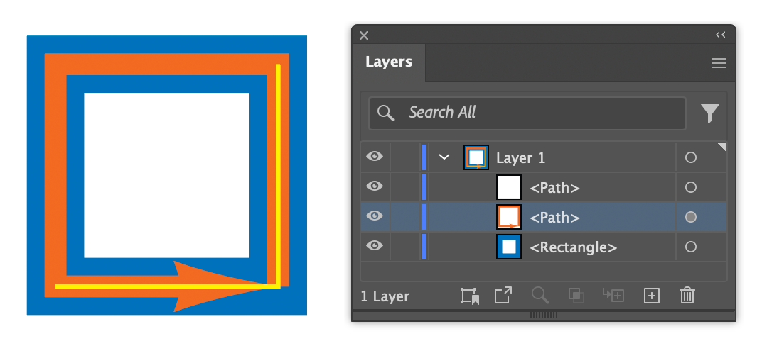
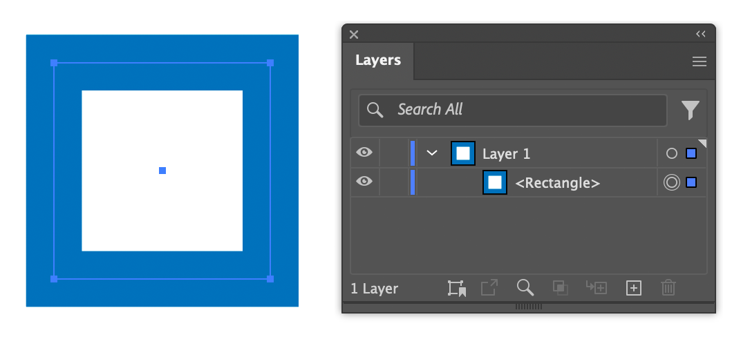
ToolShed has added a new feature in a free update: Remove Duplicate Paths. Here’s how it works. In this exercise we have a blue rectangle, an orange open path with four segments directly on the rectangle’s sides, and a yellow path over two of the segments. You can select paths to evaluate for duplicate paths, but since this test document has only these three paths, you can choose Object > Path > Remove Duplicate Paths with nothing selected to parse all paths in the document.
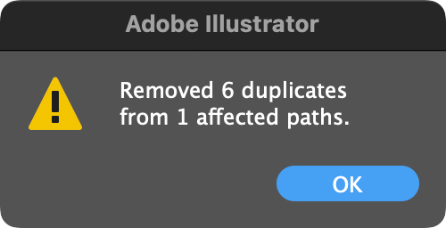
A dialog will inform you that it removed six duplicate segments, or four from the orange path and two from the yellow path.
The blue path was found to have duplicate segments, so it has been selected.
Note that the path on the bottom is preserved, and identical segments above it are removed.
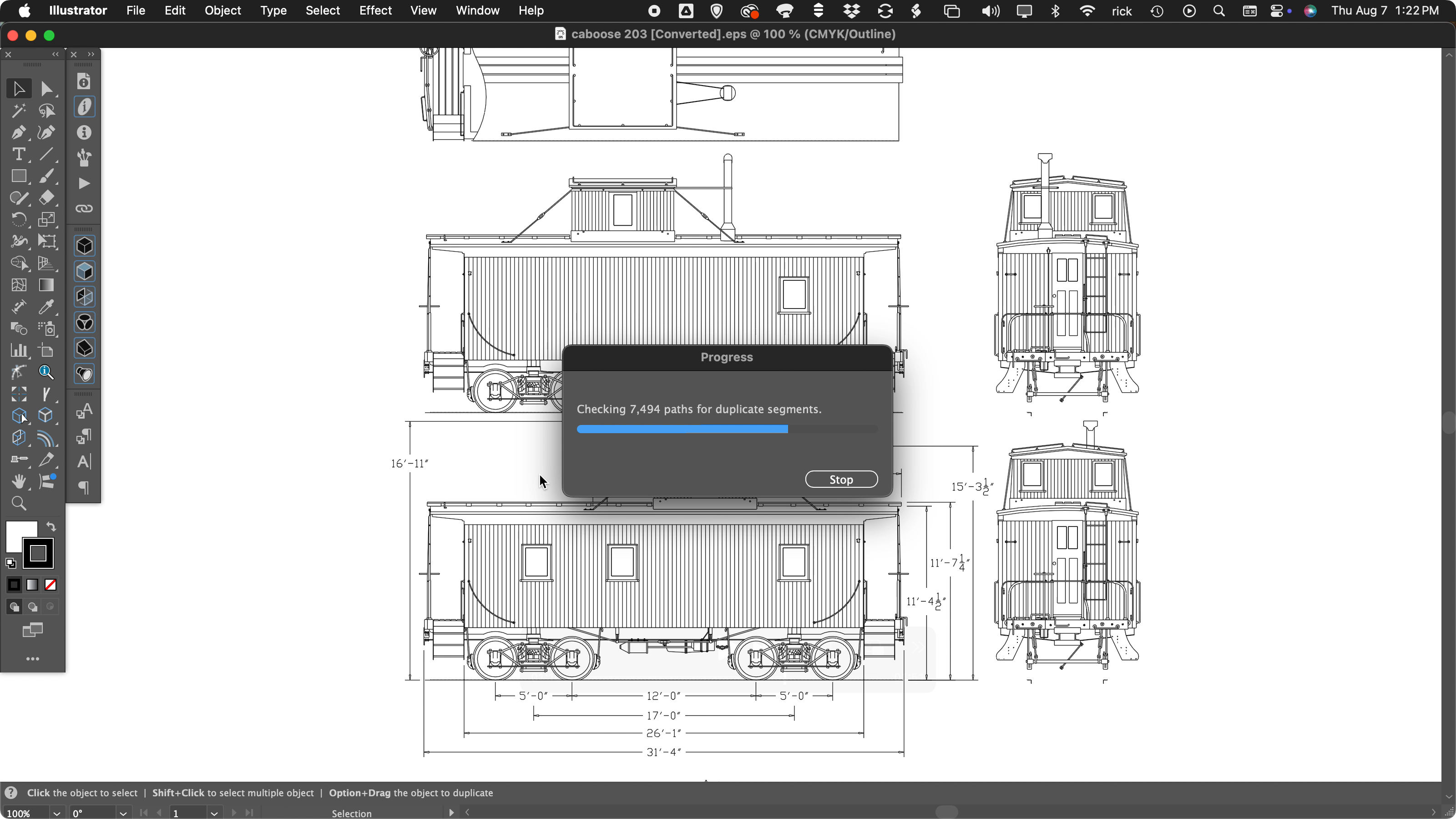
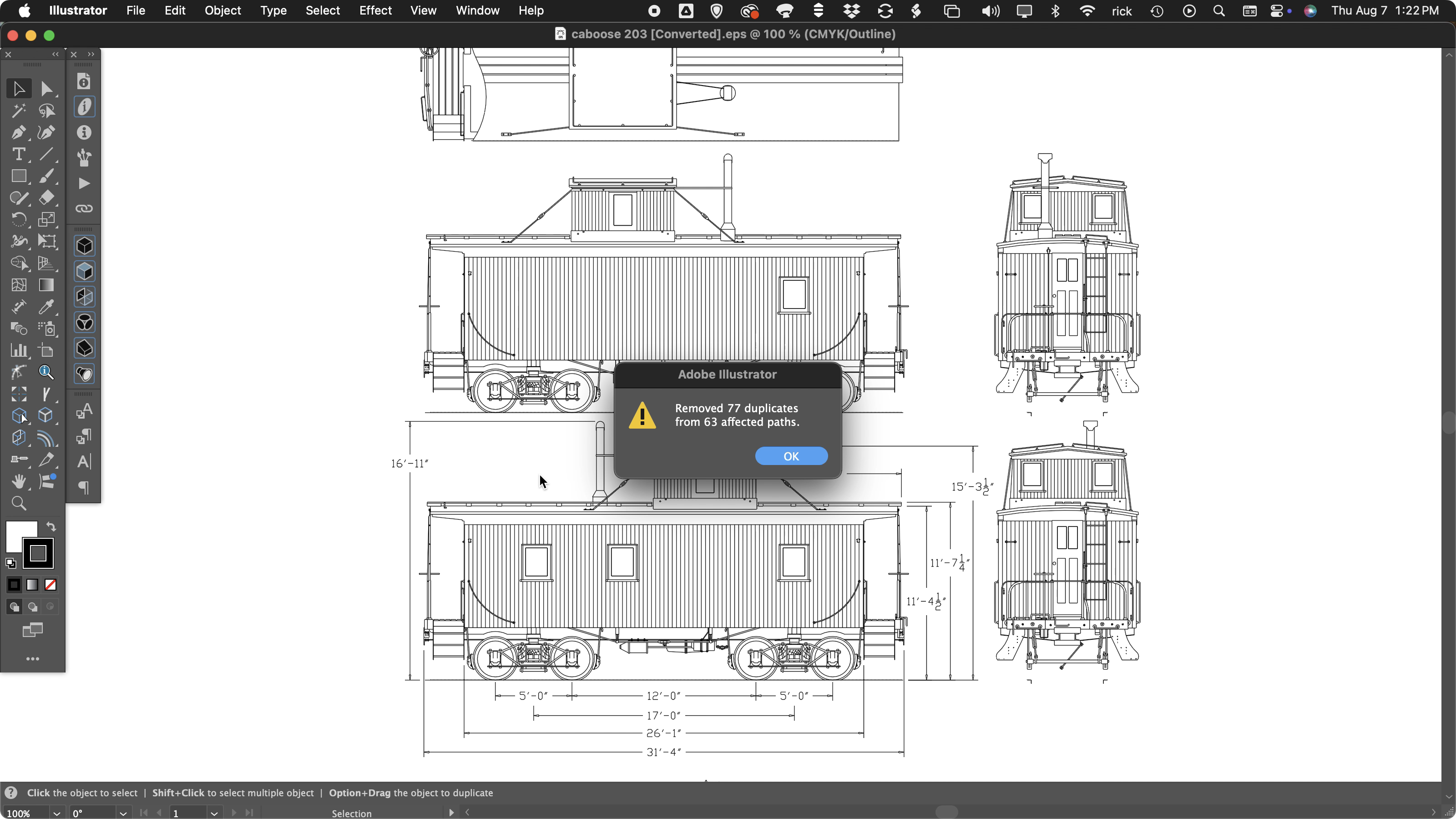
Here is an example of a more complex file, which is probably more typical of where you would use this feature. A CAD drawing of a historic railroad caboose was imported into Adobe Illustrator, and we’ll check for duplicate paths. Because there are so many paths in this file, you will be given a progress dialog.
When it finishes, you will be shown how many duplicates were found.
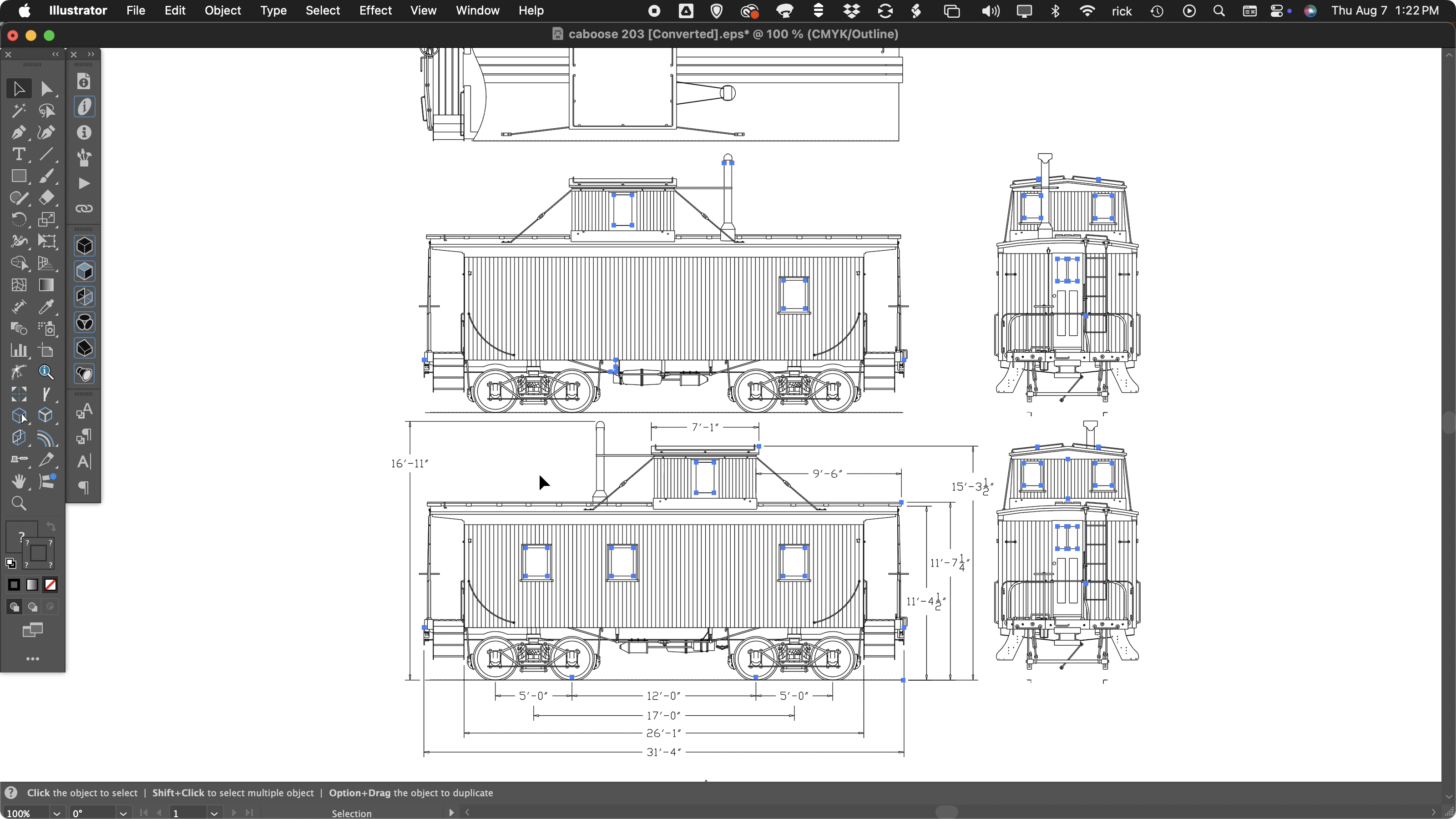
Finally, you will see the selected paths where the duplicate paths were found.
In this case, we can see that the paths with duplicate segments were areas with a filled, non-stroked path, so the presence of duplicate segments is OK. We can simply Undo the operation and be assured that we have a clean drawing to work with.
As with other ToolShed functions, it can be recorded as part of an Action and assigned a keyboard shortcut to streamline your workflow. I recommend using the free Select Menu plugin to lock or hide paths that you don’t want parsed for possible deletion.
Download ToolShed now, or simply click the Update button when your current ToolShed plugin prompts you for the update. Remove Duplicate Paths added to ToolShed plugin for Adobe Illustrator 2022-2025 only.
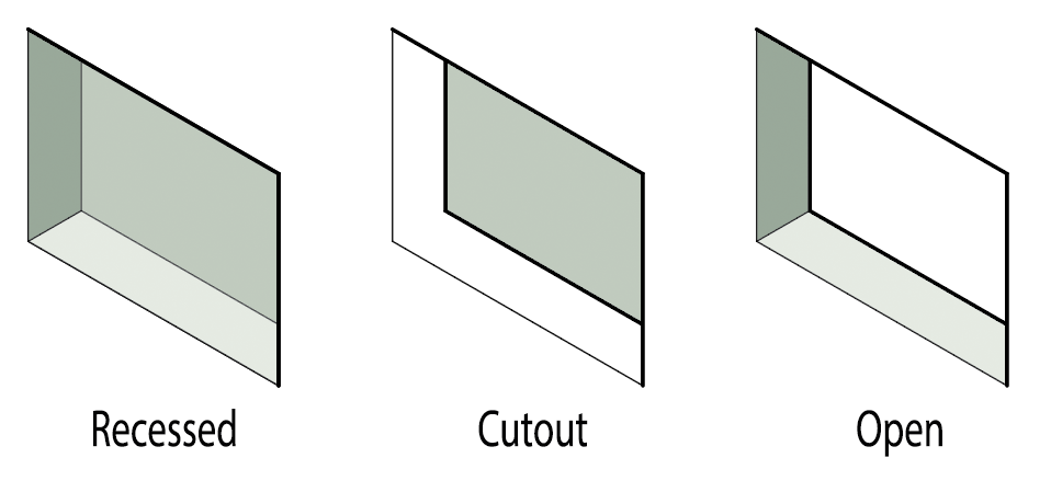
Sometimes we need to extrude a shape as negative space, that is, space cut out of some other material. This was recently added to AxoTools, but with the latest free update, it’s now improved with three modes or variations on how to do this.
Recessed appears as a depression in a surface, similar to the “debossed” effect in Photoshop. AxoTools draws side walls and a back plane.
Cutout appears to cut the shape out of some thin material and move it backward.
Open appears as a hole in some material by drawing side walls, but leaving the back open.
All three modes add a mask to fit the size and shape of the opening.
If the inverted art needs to simulate an opening in a colored shape, you can check the option to “Add white background behind art.” This adds a white fill to the mask; otherwise, any colored art behind the extruded art will show through in Cutout or Open modes.
Graffix is pleased to be chosen as the only authorized distributor for English versions of two free plugins from Totallypic. Requires Adobe Illustrator 2025 for Mac or Windows.
Fit Selection
Similar to the built-in Fit Artboard in Window command, you can use it via the menu View > Fit Selection to quickly fit the selected objects to the window size. Pairing it with a keyboard shortcut can significantly enhance your workflow efficiency.
Perceptual Gradient
This uses the OKLab algorithm to convert standard linear gradients into perceptual interpolation. The results are similar to the gradient effects offered by Adobe Photoshop. You can find it under Effects > Totallypic > Perceptual Gradient, or apply it via the f(x) option in the Appearance panel.
The back story
Jeen Hung and I have for years exchanged ideas about Adobe Illustrator and how plugins add to its capabilities. Several of the features added to my plugins were suggested by Jeen. He’s done some amazing illustrations and later studied writing his own AI plugins. Jeen provided the code for Select Menu that finds more recently-added art objects such as intertwined objects and mirrored repeats. He has continued to develop plugins for use at his business, Totallypic, and has made them available at his website. Recently, he has generously created English versions for me to distribute here.
Totallypic is a design team from Taiwan specializing in vector illustration and design. Over the past decade, we have focused on creating and licensing royalty-free graphics, achieving over 10 million downloads globally. Recently, we have also expanded into Illustrator online tutorials and plugin development, although these services are currently only available in Taiwan.
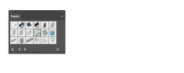
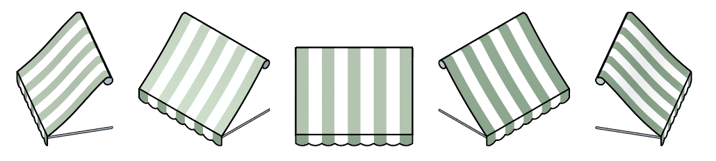
PopArt symbols can be dragged from a symbols panel and AxoTools will automatically expand them to fit your choice of axonometric planes in your current document projection. This includes extruded art, art with compound rotations, and with moves along axes.
For example, say you’re building an axonometric village and you want awnings over some of your windows. Rather than build them, or copy and paste them from a previous project, you can store one as a PopArt symbol and drag them into your document as needed.
You’re not limited to just isometric, either. PopArt will expand and conform to any face in any document projection you set, including an auxiliary projection.
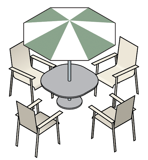
PopArt can contain several layered objects at various angles. In this illustration, only two PopArt chairs created the four seen here, and the table with umbrella is all one symbol.
Please see the AxoTools documentation for more information on creating and using AxoTools PopArt symbols. And please let me know if you create PopArt symbols you’re willing to share with others!
 Defining a perspective grid in Adobe Illustrator has long been a bit of a puzzle. Illustrators have an idea of how we want our art oriented, but the fields in Adobe’s Define Perspective Grid dialog seem to have been geared to serve the software, not the user.
 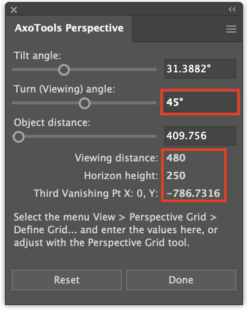 One significant advantage here is that AxoTools will calculate a geometrically-correct location for the bottom (third) vanishing point, helping to relieve much of the distortion we see in Illustrator’s perspective art.
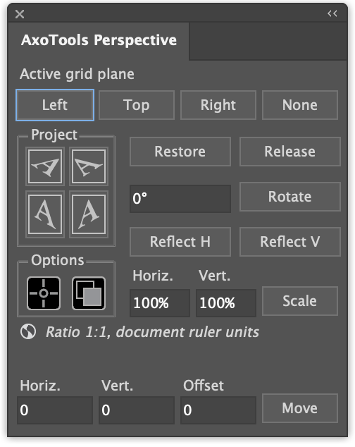 It’s hard to believe that Adobe Illustrator’s perspective grid was released way back in 2010 for version CS5! I recall being excited about it for my work as a technical illustrator. Unfortunately, it was a bit clumsy to use efficiently or precisely, and the projected art was often distorted. Over time I came to ignore the grid and just winged it on my own, or worked in isometric instead.
 The
The 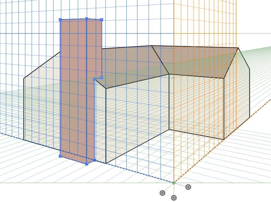


 Recessed appears as a depression in a surface, similar to the “debossed” effect in Photoshop. AxoTools draws side walls and a back plane.