Multiple line weights in technical illustration
You may have seen a recent video summarizing methods to use multiple line weights in your illustrations.
It’s probably helpful to go into a bit more detail and show more examples.
 Using a single line weight (or “stroke width” as it applies to Illustrator’s path art property) is a simple and efficient way to work.
By using more than one line weight, however, your illustrations can have more interest and suggest form.
One method assumes a light source in the upper left. Here edges facing away from the light are given a heavier weight. This was the standard where I worked at Kalmbach Publishing Co. in the 1970s. My mentors there told me it was adopted from a standard for US Patent Office drawings. It was easy to apply using pen and ink, but when they switched from Rapidograph pen to Adobe Illustrator in the 1990s, they switched to a single line weight. Adobe Illustrator, unfortunately, doesn’t lend itself well to multiple line weights, especially if the path is filled.
 Here’s an example of an illustration I did using the “Kalmbach” method, drawn in ink at 1.5 times reproduction size. Detail lines were drawn with a 4×0 Rapidograph pen, and the heavy lines were probably a no. 0 or 1 pen. In those days, we typically cut an Amberlith overlay to add a flat tint to the background, which helped separate the subject from the background.
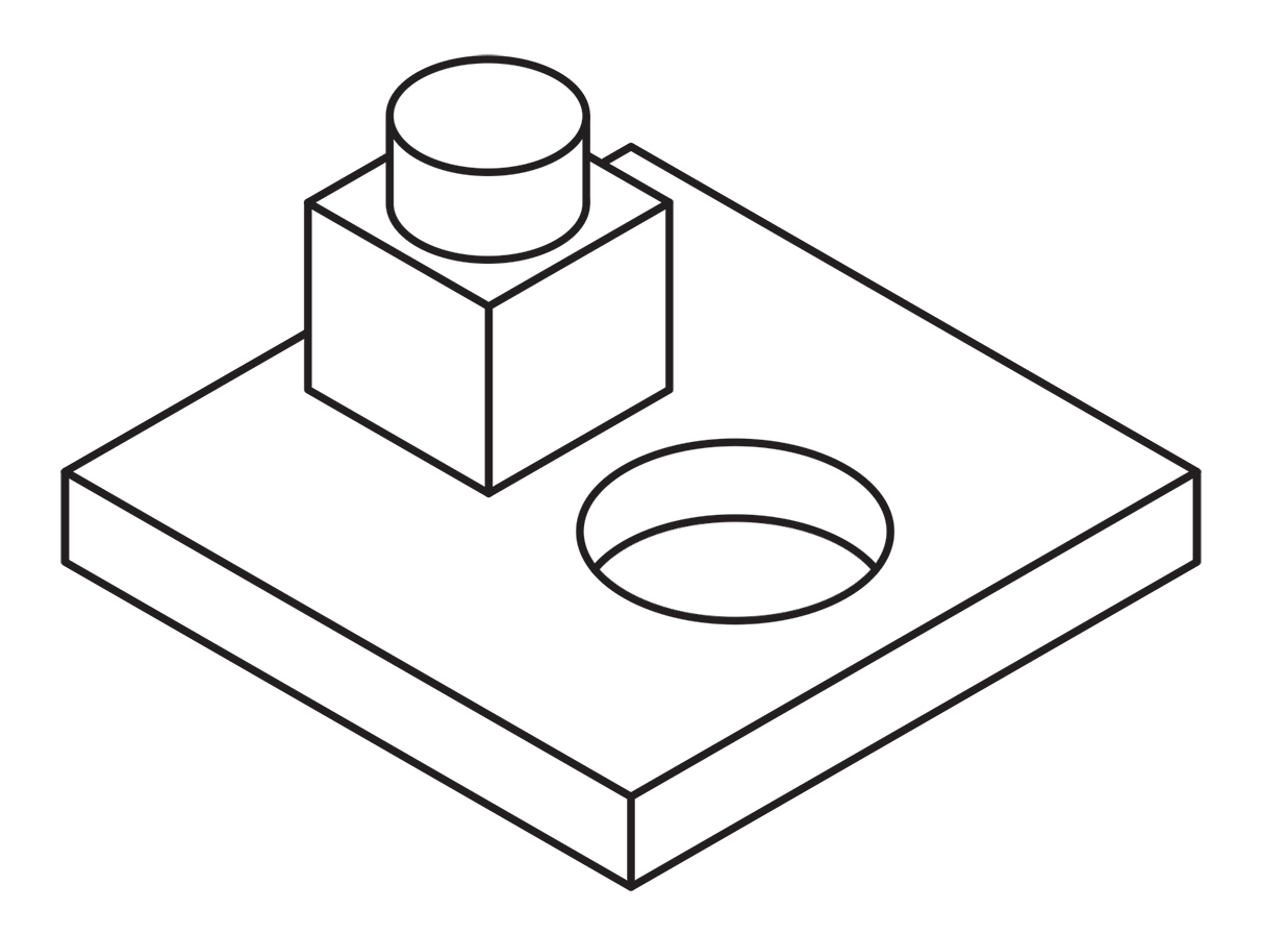
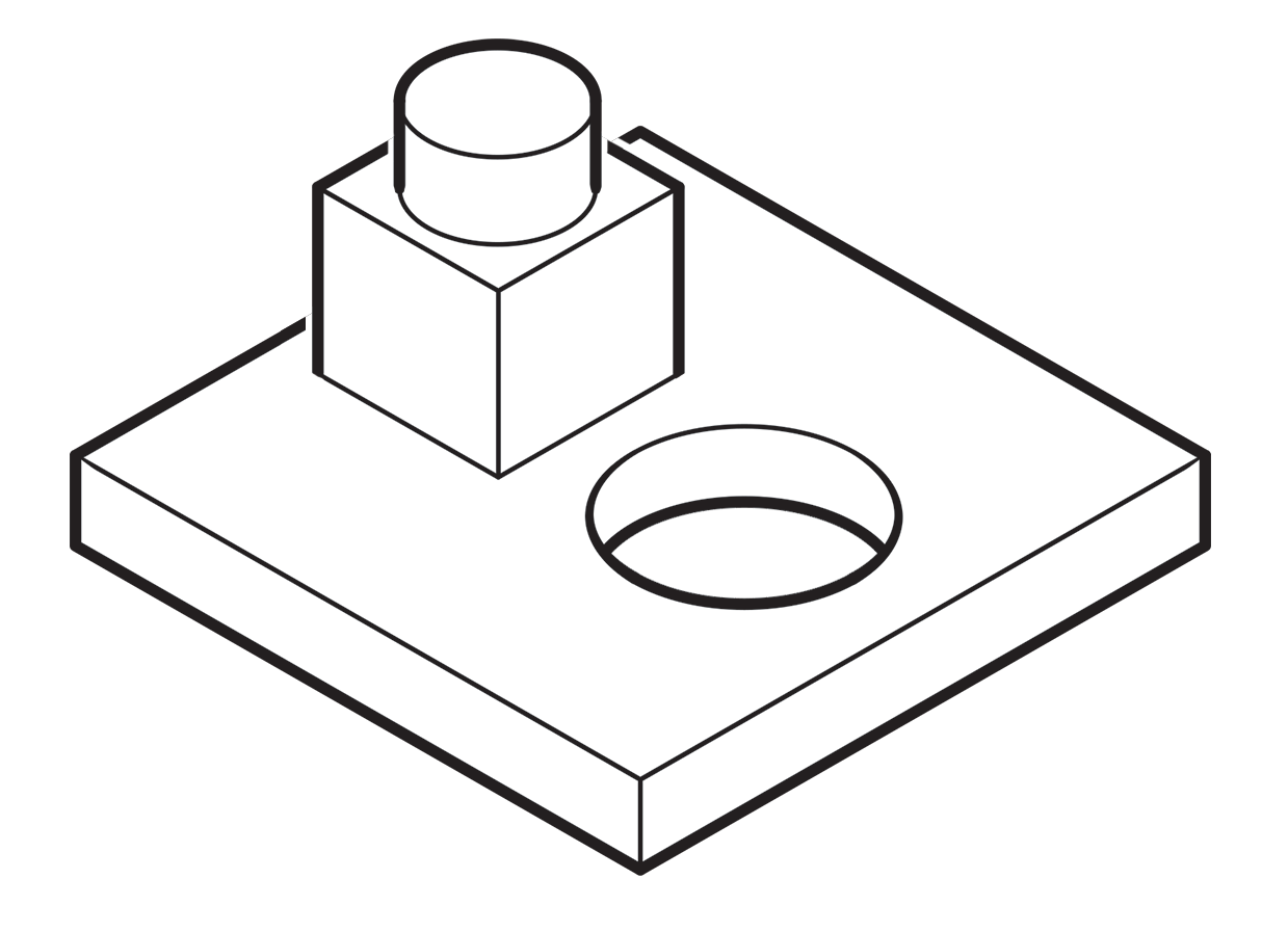 A more common method called “line contrast shading” used in exploded-view parts drawings uses heavier lines on all outside edges of objects. In this example, the bottom of the cube and cylinder are thin lines because they represent the joint between two surfaces. A heavy line would suggest the objects float above the other art. In the case of the round hole, a varied line width makes a smooth transition between the front- and rear-facing edges. Complex illustrations can use three or four line weights. Standards are more like guidelines, actually, that vary between people and between businesses, often based largely on the personal preference of someone with experience and/or influence.
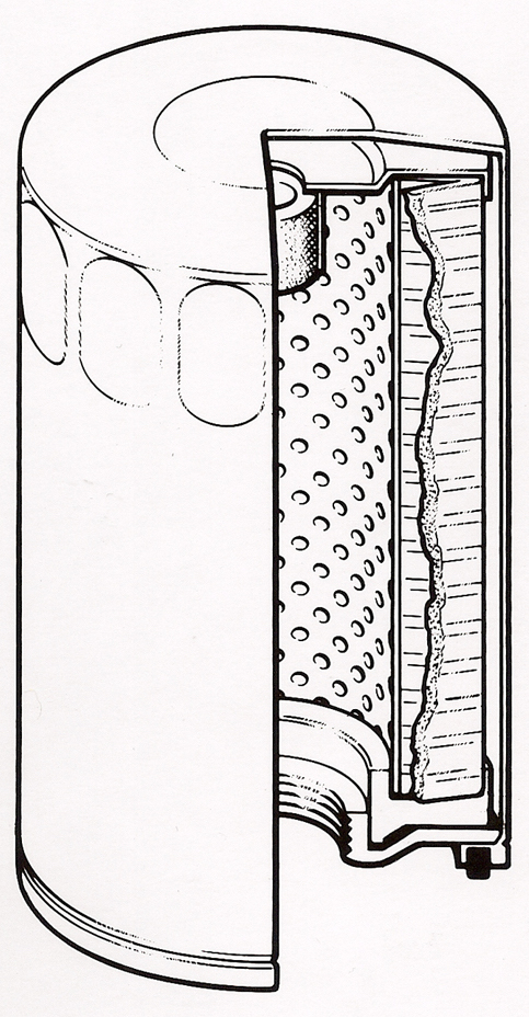
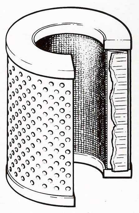
Greg Maxson drew these filter illustrations with pen-and-ink on Mylar for Hyster Co. back in the late 80’s. He explained, “You could really get lost in the detail with pen-and-ink. Lines within an object are thin, exterior object lines are heavier, and exterior object lines that are down and away from the light source are heavier and darker still. The heavying up of the lines down and away from the light source was typically used when illustrating larger equipment, machinery, etc. to give those objects more visual weight. Appropriate for rendering a bulldozer, but less appropriate for rendering the exploded illustration of an ink pen, for example. Of course, super thin interior object lines were/are common when used to represent less than 90 degree radii, and thin broken lines to represent a highlight along an edge, knurling, screening, etc.”
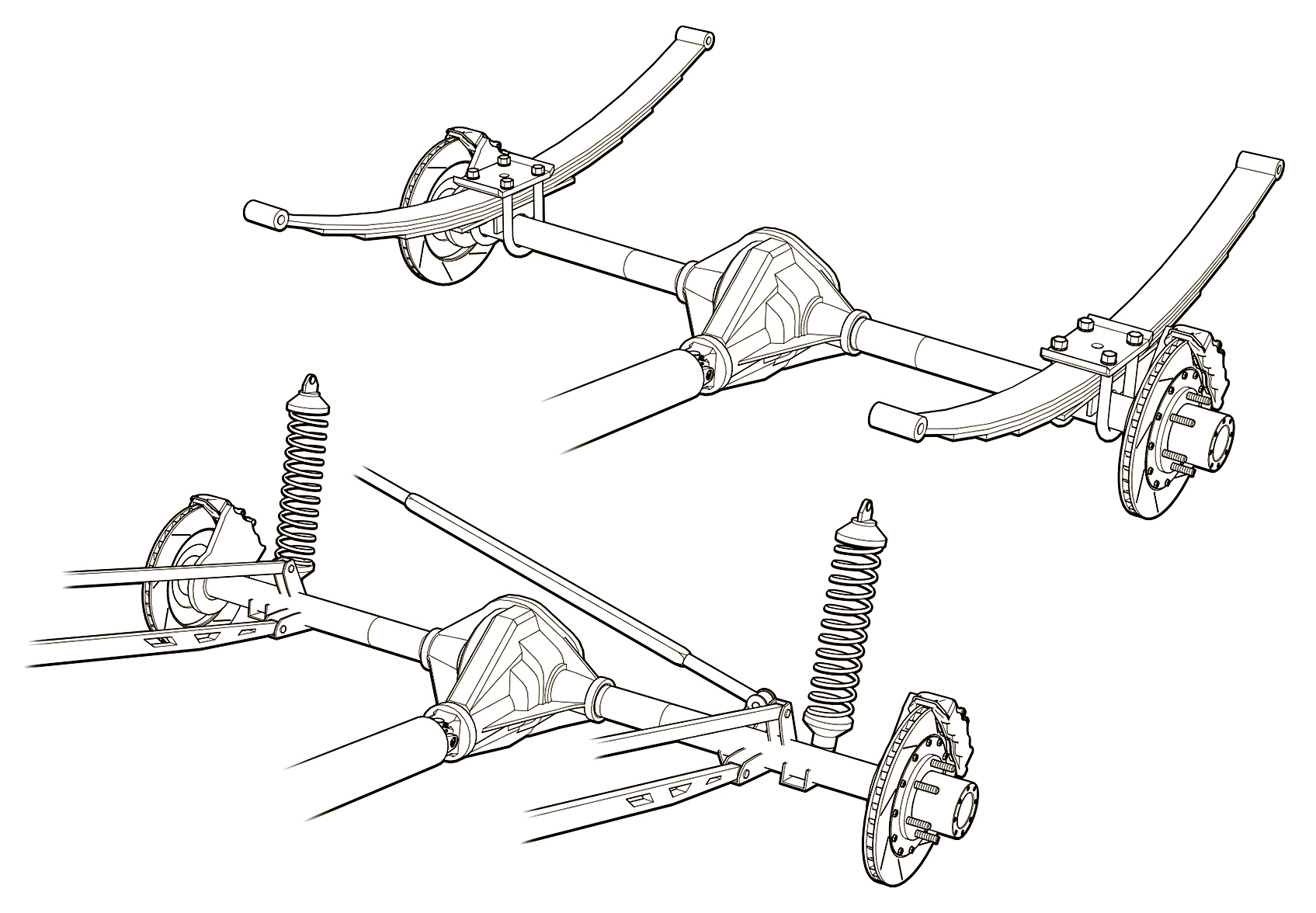 Greg used a three weight treatment on this Raptor suspension illustrations for Car and Driver magazine.
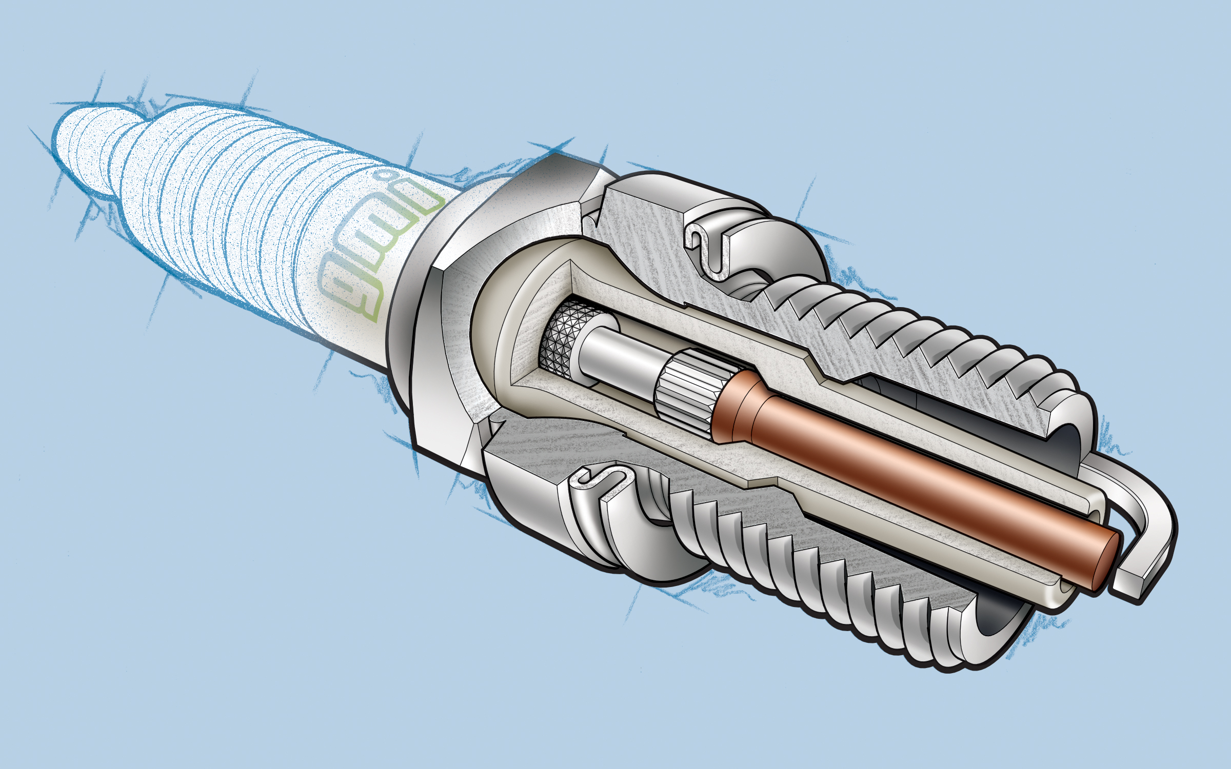 One more piece by Greg Maxson shows his skill at technical illustration using a variety of software, often including SketchUp, Illustrator, and others. Here he adds clarity to the subject with varied line weights, line colors, sometimes sketchy line treatments, and meaningful shading and textures in filled areas.
When AxoTools adds add multiple line weights, it places stroked paths above non-stroked filled paths so weights can change as needed anywhere along the object without affecting the fill. With a simple click of the Axo Line tool, you can toggle weights between thick and thin as necessary. In the coming months, users can expect to see more refinements in AxoTools handling of stroke properties. Please contact me if you have ideas that can make your work faster or easier.
![]()