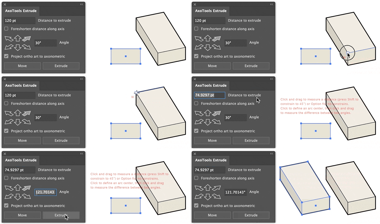
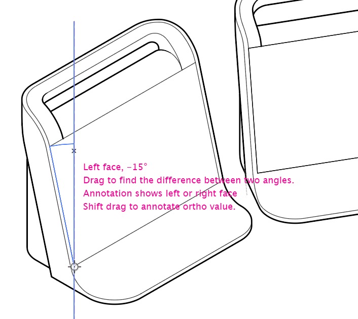
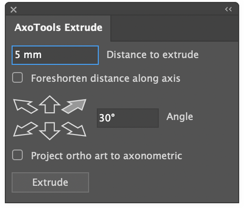
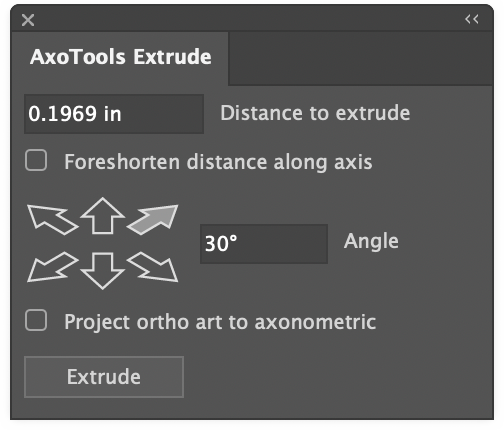
AxoTools is not a 3D application, but tries to assist illustrators in achieving a 3D look the best it can. Simple shapes are pretty straightforward, but complicated shapes can wind over and under each other like an Escher drawing. In that case, AxoTools evaluates the paths and makes its best guess on correctly stacking the pieces.
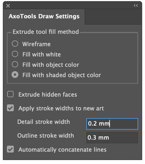
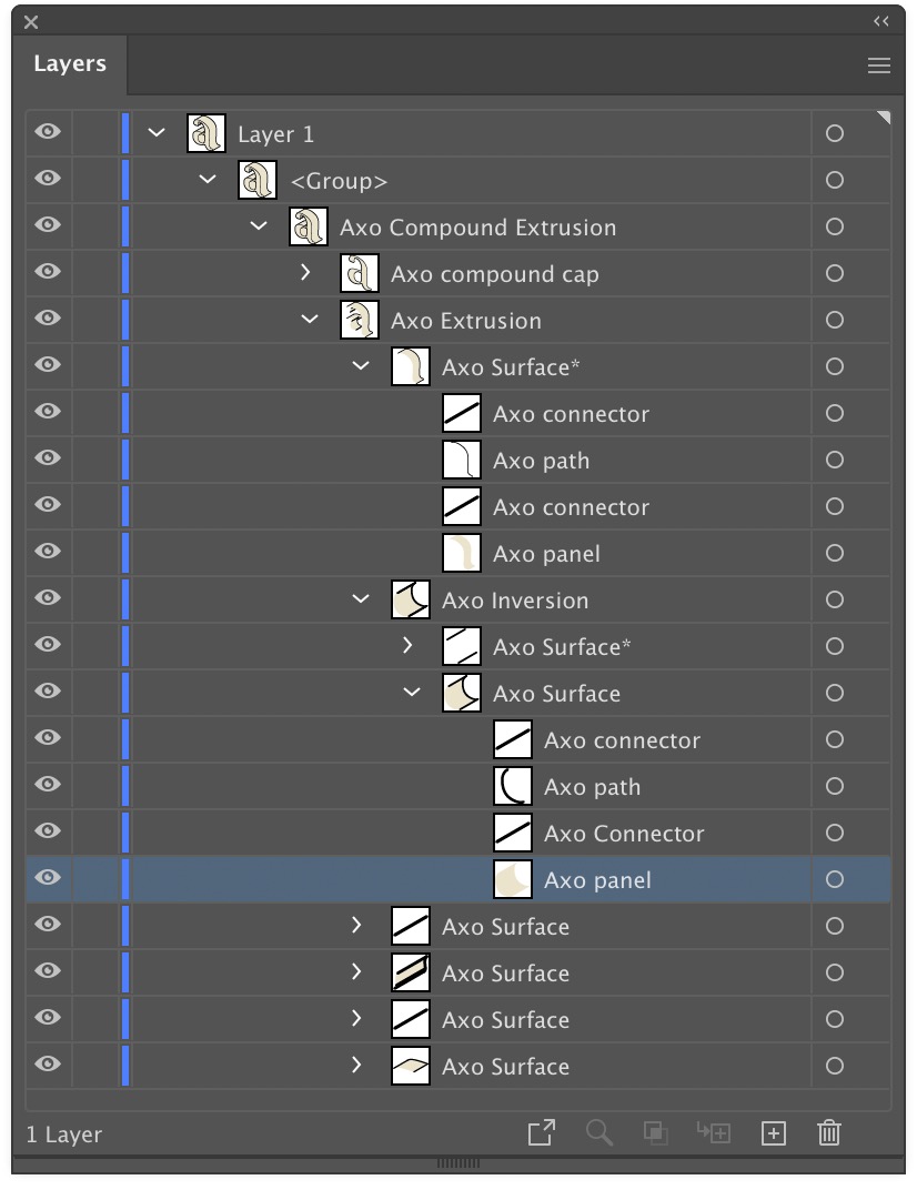
When a path is extruded, AxoTools creates closed paths for fillable areas and open paths of multiple stroke weights. To make things more easily edited, the pieces are organized into groups. In the Layers panel, you can expand these groups to find the pieces you may want to edit. Compound paths contain elements nested inside of other elements, so things get a bit more complex.
The front surface is named as a “cap,” and is placed above all of the edge pieces. The edges, which give it depth, are divided into surfaces. Each surface is composed of fillable “panels,” stroked “paths” that follow the original path’s shape, and “connector” pieces for corners that connect the front cap to the rear cap (the rear cap and hidden surfaces may or may not be drawn depending on your Extrude panel settings).
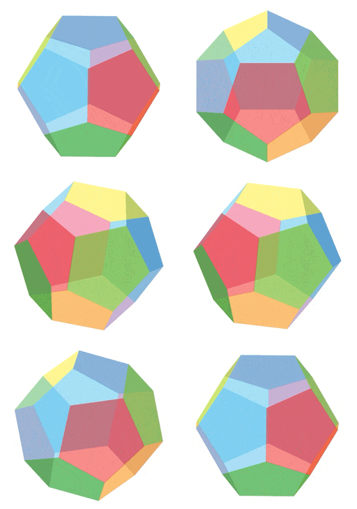
This is not an animation, but a screen recording right out of Adobe Illustrator! Each face of this dodecahedron is a live Transformation object created from the same pentagon shape, with movements and rotations added in the AxoTools Transformations panel.
Sure, it’s unlikely you’ll ever need a shape like this, but we often need art rotated away from our usual three planes. This demonstrates how, whether it’s a skylight, an instrument panel, or graphics on a milk carton, that task is now a whole lot easier!
You can download this file from the link at the end of this post and with AxoTools installed, even in demo mode, examine how this crazy “disco ball” was built.
Each facet is made from a pentagonal path, turned into a live object that specifies its movements and rotations. The orientation is set relative to the current AxoTools projection, so in the AxoTools Projection panel you can adjust the settings with the dial controls to see the dodecahedron rotate as a unit in real time!
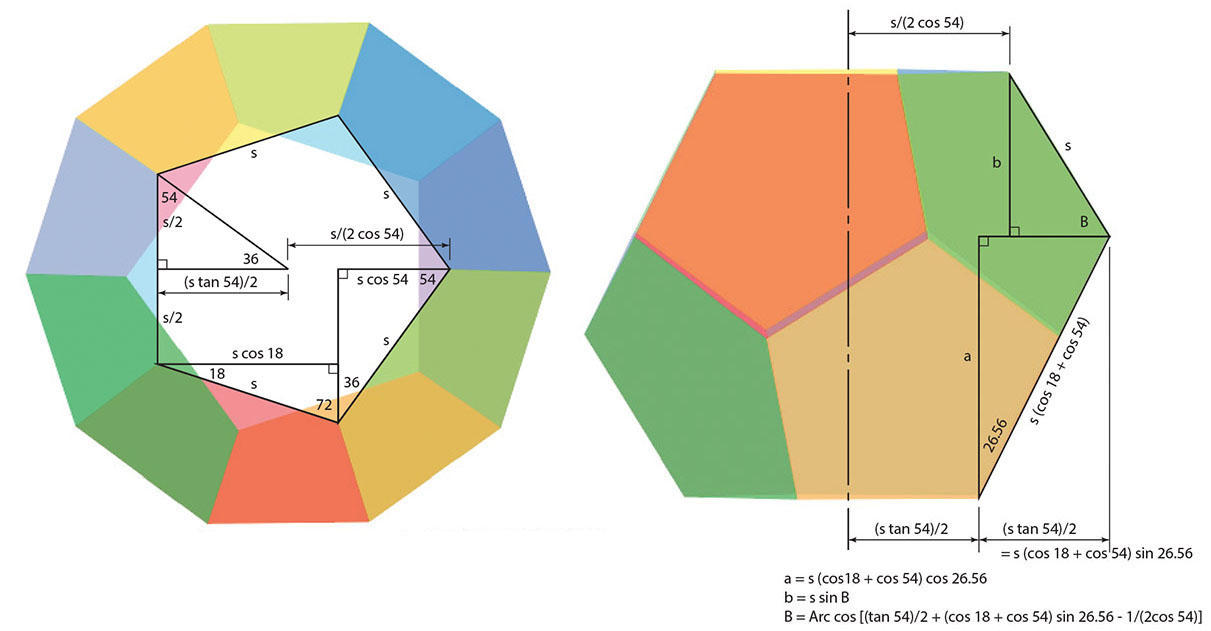
When Ron Kempke built this, he used his math superpowers to determine the angles and offsets.
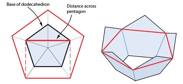
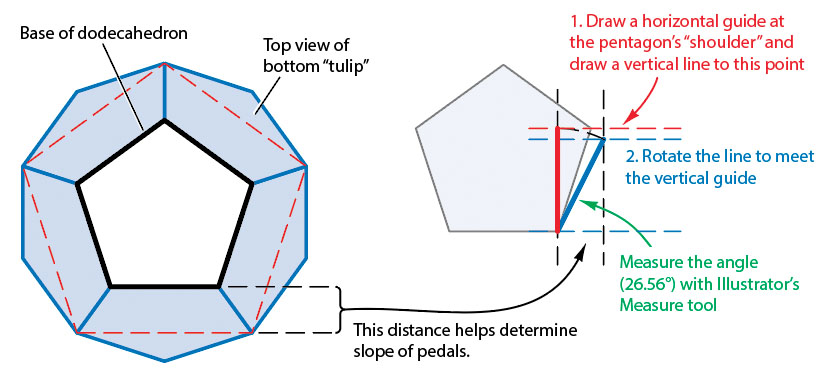
But fear not! For those who would rather not break out a scientific calculator, it’s possible to let Illustrator do most of the heavy lifting. First, make a copy of your base pentagon to create some guide art. Imagine the dodecahedron as two “tulip” shapes placed face-to-face. We know that the shape across the “shoulders” of the tulip would be equal to five segments equal to the width across the base pentagon. That will allow us to draw a top view of the shape.
The offset from the base pentagon to the section at the shoulders tell us the foreshortening of the slope of each “pedal.” Draw vertical guides this distance apart. Draw a vertical line from the base of the pentagon to the height of its shoulders. Rotate this line until its width matches the offset distance in the top view. Measure the angle of this line (26.56° in this case) for use in the Transformation objects later. Draw a horizontal guide at the top of this rotated line.
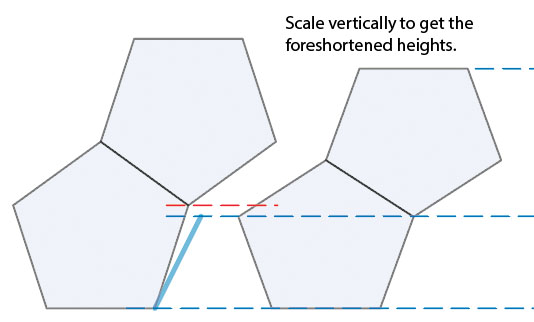
Copy the pentagon and rotate the copy 180°, then position it so each pentagon’s tip and shoulders match as shown below. Select the pentagons and scale them vertically, using the foreshortened height of the rotated line as a guide.
This art, of course, isn’t a real side view, since the upper and lower pieces would be horizontally scaled and sheared differently. We’re only interested in finding the foreshortened vertical dimensions in order to create our Transformation objects.
With these principles in mind, click the link below to download Ron’s file and examine the settings in each piece.
Sometimes we run into jobs that require variations of artwork where we start with a sample, and once approved, the customer provides the remainder of the information. This often means duplicating what we have and embarking on a tedious process of changing the parts that are different. If the text needs more than one style, re-applying fonts, weights, colors, etc., can become time consuming. Here’s a way to streamline that process using the TextSync plugin.
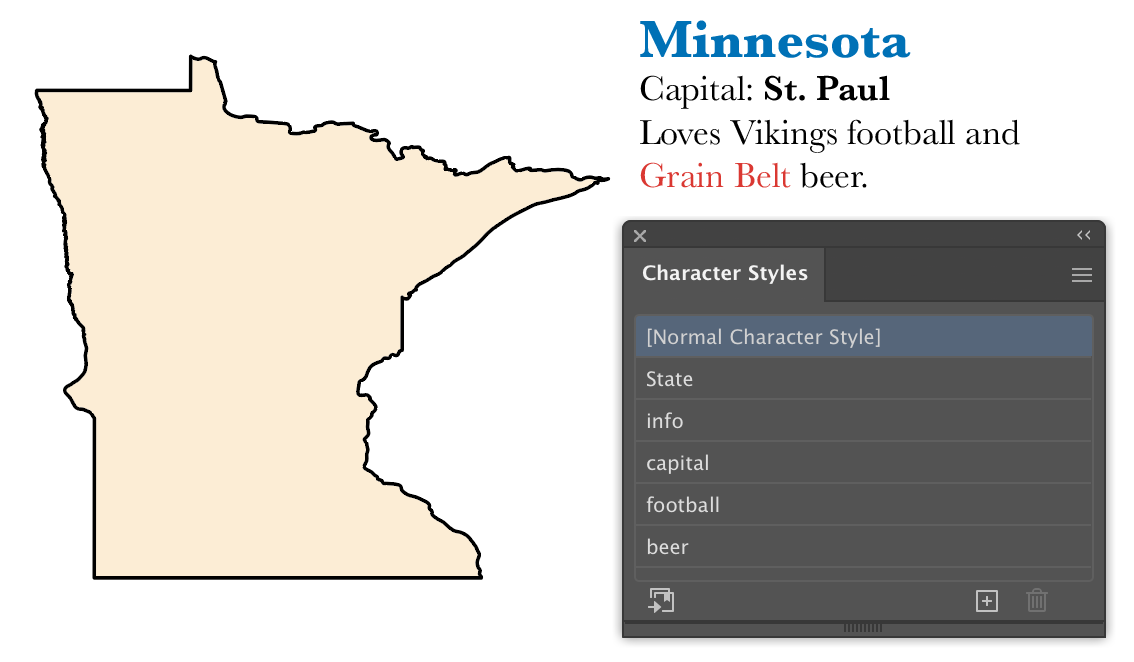
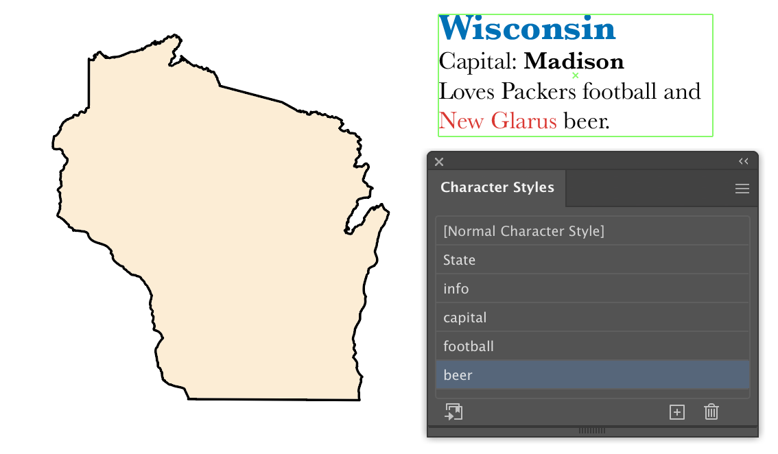
Say we’re doing a series of information on various states. Let’s start with Minnesota, using a state outline and an area text object. Since the text frame may shrink or grow from one state to another, it’s probably a good idea to go to the Type menu and set the Area Type Options to enable Auto Size.
In this first example, we set the state name to a larger size, bold, and add a color. Assign a character style (I called it “State”). Assign the remaining text another style (in this case “info”). Select the capital city of St. Paul and change its formatting, then assign a style. Next, the term “Vikings” will change for other states, so select it and assign a new style, even though the actual formatting doesn’t change from the text surrounding it. Last, assign a character style to the text of the beer name.
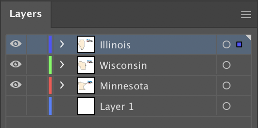
In the Layers panel, duplicate the layer and give each a descriptive name. With nothing selected, export all of the text of the document with the menu command File > TextSync > Export Text Objects… You’ll see a dialog prompting you to create a text file to save the data in. At this point your document contains a hidden index correlating the text objects to each line item of the file. Because of the way the text is broken into blocks according to its formatting, it’s probably easiest to edit it in a spreadsheet application such as Microsoft Excel. Here’s what our sample’s file looks like:
The first column contains the ID of each text object. Do not change or delete these! The “<p>” at the beginning of column C represents a paragraph break. Similarly, a tab character would be indicated with a “<t>” notation. You can see here that it’s helpful to not include the return character in the formatted state text, so that it stays in the column we won’t edit.
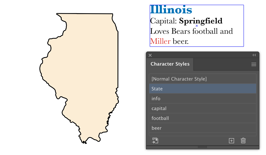
Let’s select cell B1 and change the state name to Illinois. Now tab to column F and change Vikings to Bears, then change the beer name in column H, then make changes for Wisconsin in row 2.
Now we’ll import this back into our Illustrator document. We can save this file out as tab-delimited text and in Illustrator, select it with the menu item File > TextSync > Import Text Objects… A faster way, though, if you’re editing the text file on the same computer as your Illustrator file, is this:
Select the data
Copy the data to the clipboard
In Illustrator, press the Alt or Option key as you select the menu item to import.
Your text will update with formatting preserved, because the tabs in the exported file represent the areas where formatting changes. That’s why we gave the football team its own character style, even though the characters didn’t really change. If we replace the state outlines to match, we’ll get something like this:
To change the text formatting, you need only double-click the character style in the Character Styles panel and change the specifications there, and the text with that style will update everywhere in the document.
You’ll probably find this most useful for when you have many labels with similar formatting, or using layers with different specifications for different products.
If you have one or more text objects selected when you export, only the selected objects will be exported. With nothing selected, everything is exported. If text files are imported with no IDs or IDs that don’t correlate with existing text objects, new text objects will be created, one for each line of text. This can be useful for importing files with lists of callouts to be added.
Please keep in mind that each “chunk” of text represents what’s known internally in Illustrator as a text run. Each text run ends and a new one begins where the formatting changes. TextSync doesn’t support specific format changes, but was created to allow the contents of many formatted callouts to be exported and edited outside of Illustrator, then updated in their original locations with minimal effort.
I hope this saves you as much time as it’s saved me. Remember, it comes with 100 trial uses to import and export to test if it’s useful for you.
Holy mackerel (as Wisconsin governor Tony Evers — and I — would say), it’s sure been a while since the free Illustrator scripts here were updated. The old version 10 scripts are still there, along with 31 updated for Illustrator 2020 and 2021. I’ve recently retired, but there’s no reason the scripts can’t continue working for others! They’re AppleScripts for Macs, but that’s what I knew best and what I worked on at the magazine publisher.
There aren’t any wiffy design effects. It’s more a collection of in-the-trenches workhorse scripts that got me through a lot of mundane tasks. Here’s an example. Revising old maps or illustrations can get complicated when text styles change from one year to the next, or from one publication to another. When I created the templates for each title they included character styles for callouts, figure numbers, titles, cities, states, copyright, etc. When reusing older art, there were different approaches one could take with the help of a few scripts.
I’d typically start with a new document using a template, then copy and paste the old art into the new document. With everything still selected, choose the script “re-apply char styles” so, for example, the old-styled text would be updated to the current font specs. The script first hides all unselected text so all you see is the new stuff. Next it updates selected text to defined styles, and the updated text is then hidden as well. At this point, the remaining text needs to be assigned one of the standard character styles. This eliminates the problem of straggler callouts that show up later in an oddball font or size. Now you can show the hidden art and make adjustments as needed. More often than not, the art needed to be scaled to fit a different size or shape, so after scaling, the selected text can have its standard font size restored in one fell swoop.
The templates I made include sample text showing all of the character styles, as well as graphic bits with symbols and graphic styles. Sometimes it was simpler to copy these samples to older art (saved under a new file name) and run the script “redefine char styles from selection.” The selected sample art can now be deleted, then run the script “find unstyled text” to select and apply standard styles to any style stragglers.
If a script is not quite what you need, I’d encourage you to open it in a script editor and experiment with modifying it.
Update: now with AxoTools 16.2, there’s an easier way!
Ron Kempke, who wrote the math behind AxoTools, has provided a follow-up to this post on using an auxiliary view in AxoTools, with these steps on taking it a step farther. Even with the oblique plane rotated at all three axes, we can still construct an auxiliary view and establish an axis for extruded art on that plane.
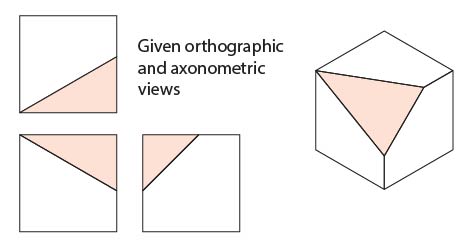
In this example, we have a simple cube with one corner removed. With the three sides projected, the triangle shape practically draws itself, but a problem arises when other objects need to be added that match this orientation.
Here, Ron walks us through this process using the AxoTools Projection panel along with Illustrator’s built-in Scale and Rotate tools.
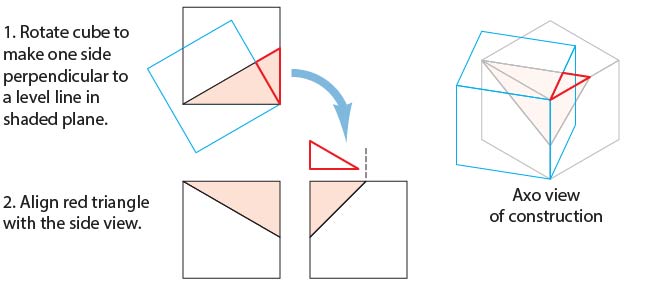
To start, we need to do some construction drawing in the orthographic top view. You’ll probably want to work on copies of these views. Select the long side (hypotenuse) of the triangular shape in the top view. Copy and paste it, then rotate it 90°. Position this line to divide the shaded triangle at its right-angle corner at the corner of the cube. Use this as a guide to draw the red guide triangle.
Align the right angle of this triangle with the upper left corner of the right side view. Rotate the top view to match the guide triangle, as shown in the blue square below, then project this to the axonometric top view.
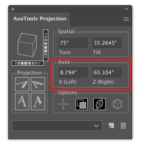
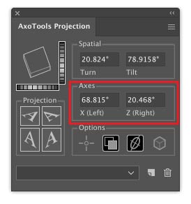
Use Illustrator’s Measure tool to measure the angles of this projected shape. Enter these values into the Axis fields of the Projection panel, which will then become a new (but temporary) axonometric view. The top face of the preview proxy cube in the Projection panel should resemble the rotated cube in your art. Note that these values are for this example only; your angles will certainly be different. If you now project the left and right ortho views, it should resemble the blue cube shown above.
Select the right orthographic view and scale it so that the shaded triangle matches the width of the red guide triangle.
Now on this foreshortened right side view, rotate a copy of the angled line -90° as shown. Here it’s colored green to distinguish it from red guide lines. Remember that having entered new values into the Projection panel axis fields, your projection now matches the blue cube shown below. Project the new guides into your axo view.
Measure the angle of the green guide line that represents the perpendicular, and save that value for later. Rotate the oblique surface and red guide lines so that the perpendicular is perfectly vertical.
If you’ve entered the new X and Z axis angles correctly, the top surface of the preview cube will be oriented at the same angles as your red guide lines.
You now have an orthographic (top-left) view of your oblique surface! Add your additional details. It’s worth noting that the red guide line at the top corresponds to the upper edge of the surface on the top view.
Now extrude any objects on this surface, along the vertical axis. You can do so visually with the Extrude tool, or numerically with the Extrude panel (be sure to check the Foreshorten option). If you have a left or right view showing the depth of the objects on this view and you’ve placed reference points for these views, you can drag by reference in the side view and the depth will be measured and foreshortened for you. (If you extrude a shape on this surface numerically from the Extrude panel, you should be aware that normally objects at this angle recede, so you’ll have to rotate it 180°.)
If you’re using reference points here, remember to redefine them in your standard ortho views when you’re finished with these details.
Finally, set your projection back to isometric or whatever projection your overall illustration used.
In review, the basic steps are:
Find the plane’s perpendicular from the top view.
Define a projection along the top perpendicular to find the plane’s side perpendicular, which is also its extrusion axis, from a side view.
Spin the oblique surface so that its extrusion axis becomes vertical.
Define another projection based on the rotated guides and un-project the oblique surface.
You now have an ortho view of your oblique surface that you can add details to, and save for future reference.
Project a top-left axo view and extrude any objects on that surface.
Spin the oblique surface back to its original orientation.
Many thanks to Ron Kempke for this useful and fascinating exercise!
Update: Now with AxoTools 16.2, there’s an easier way!
Every technical illustrator, it seems, eventually runs into a situation where a surface they’re drawing doesn’t exactly match the top, left, or right views. If one edge of a rectangle that defines that surface coincides with the X or Z axis, there are at least two ways to project that angled face. Let’s say you want to add a dial or knob to this control panel.
In conventional drafting, you’d draw what’s called an auxiliary view for the tilted panel, then mathematically calculate the locations of the panel’s elements in the axonometric (or isometric) view. One way might be called the “rotate and force-fit” method.
Here’s a sequence of steps that shows how that works, and illustrates the reason those four “Rotate” and “Unrotate” items were added to the flyout menu.
Of course, the axis of the ellipse is at a different angle than any axis, so here’s a method that uses axonometric logic to reverse-engineer the projection of that surface in order to use the Extrude tool to accurately draw the cylindrical shape of the knob.
After this technique, be sure to restore your axonometric projection to the previous settings!
New tools are currently in progress for AxoTools, but until they’re available, this should help you get through some of those unusual situations.
I was recently contacted by Iván Gómez about doing videos on my plugins. Iván is a certified Adobe instructor in Columbia who has done many other videos on various aspects of Illustrator, Photoshop, and InDesign, which are available on YouTube. He chose to do a video on AxoTools, which is very informative. I have an AxoTools video in progress also, but it won’t be available until after the next AxoTools update featuring a few new tools.
If you’re interested in AxoTools, please watch this as it demonstrates some important concepts:
Overview of isometric, dimetric, and trimetric projections
Setting and changing the orientation of your projection
Placing and moving common reference points
Projecting using buttons in the panel, using menus, or custom keyboard shortcuts
Moving objects in the axonometric view by dragging in an orthographic view
Using the AxoDraw tool to draw constrained lines
Using the AxoScale and AxoRotate tools to modify projected art
Viewers can also benefit from a coupon code shown in the video, good for 20% off any Graffix plugins during August 2020.
Thanks, Iván, for doing the video I must confess I should have done months ago!
The newer, larger, higher-resolution displays are certainly a wonderful development for every illustrator and designer. For plugin developers, it also means we have to create icons and images used in the UI at several sizes including 100%, 150%, 200%, 400%, etc. Unfortunately, there’s no direct support for displays running under Windows that work at 125%. The problem is that panels display at 125%, but the controls within it are still scaled at 100%.
One workaround is to simply set your display to 100% in the Windows Setting > System > Display. This makes the few problematic panels display correctly, but this probably isn’t the setting you want for everything you do on your PC.
Another option is to override the DPI setting only for Illustrator. To do this, locate the Illustrator.exe app in the Programs folder, right-click its icon, and select Properties. In the Properties window, select the Compatibility tab, then click the button to Change high DPI settings. In this window, check “Override high DPI scaling behavior.” The interface isn’t as sharp as it would otherwise be, but some users may find this an improvement until a better method is available.
A better option for many is to let Adobe Illustrator take care of it. This dialog usually has a slider for UI scaling, where the smallest setting usually works best. If yours has the two radio buttons as shown here, set Illustrator’s User Interface preference to Scale to Higher Supported Scale Factor. With this setting, you won’t have to mess with the compatibility settings or deal with a blurred interface. If you normally have your display set to 125%, this can be very helpful.
If you have any tips to share, please submit them!