Totallypic plugins available in English (free download)
The plugins
Graffix is pleased to be chosen as the only authorized distributor for English versions of two free plugins from Totallypic. Requires Adobe Illustrator 2025 for Mac or Windows.
Fit Selection
Similar to the built-in Fit Artboard in Window command, you can use it via the menu View > Fit Selection to quickly fit the selected objects to the window size. Pairing it with a keyboard shortcut can significantly enhance your workflow efficiency.
Perceptual Gradient
This uses the OKLab algorithm to convert standard linear gradients into perceptual interpolation. The results are similar to the gradient effects offered by Adobe Photoshop. You can find it under Effects > Totallypic > Perceptual Gradient, or apply it via the f(x) option in the Appearance panel.
The back story
Jeen Hung and I have for years exchanged ideas about Adobe Illustrator and how plugins add to its capabilities. Several of the features added to my plugins were suggested by Jeen. He’s done some amazing illustrations and later studied writing his own AI plugins. Jeen provided the code for Select Menu that finds more recently-added art objects such as intertwined objects and mirrored repeats. He has continued to develop plugins for use at his business, Totallypic, and has made them available at his website. Recently, he has generously created English versions for me to distribute here.
![]()
About Totallypic
Totallypic is a design team from Taiwan specializing in vector illustration and design. Over the past decade, we have focused on creating and licensing royalty-free graphics, achieving over 10 million downloads globally. Recently, we have also expanded into Illustrator online tutorials and plugin development, although these services are currently only available in Taiwan.
Download Totallypic plugins
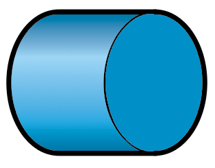
 Using a single line weight (or “stroke width” as it applies to Illustrator’s path art property) is a simple and efficient way to work.
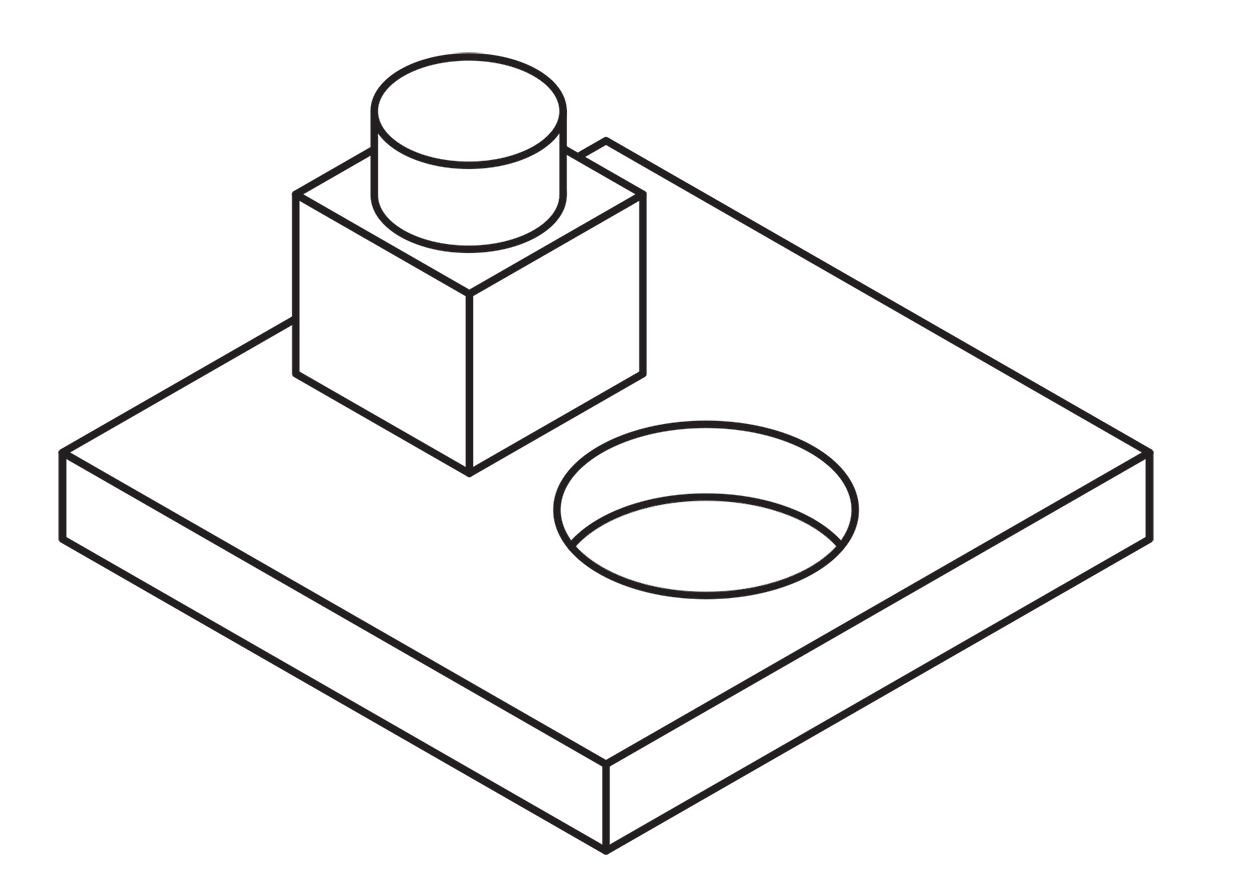
 Here’s an example of an illustration I did using the “Kalmbach” method, drawn in ink at 1.5 times reproduction size. Detail lines were drawn with a 4×0 Rapidograph pen, and the heavy lines were probably a no. 0 or 1 pen. In those days, we typically cut an Amberlith overlay to add a flat tint to the background, which helped separate the subject from the background.
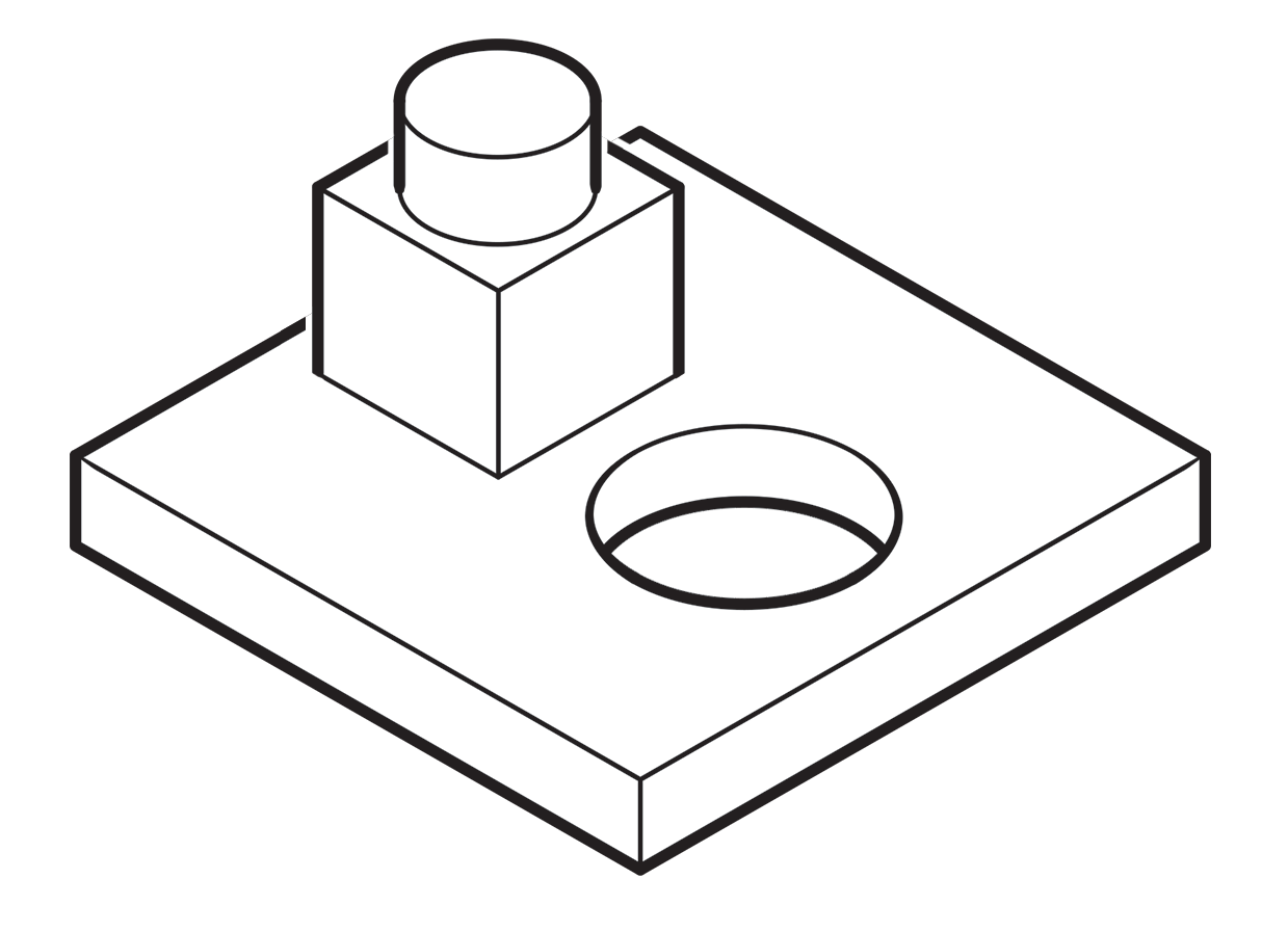 A more common method called “line contrast shading” used in exploded-view parts drawings uses heavier lines on all outside edges of objects. In this example, the bottom of the cube and cylinder are thin lines because they represent the joint between two surfaces. A heavy line would suggest the objects float above the other art. In the case of the round hole, a varied line width makes a smooth transition between the front- and rear-facing edges. Complex illustrations can use three or four line weights. Standards are more like guidelines, actually, that vary between people and between businesses, often based largely on the personal preference of someone with experience and/or influence.
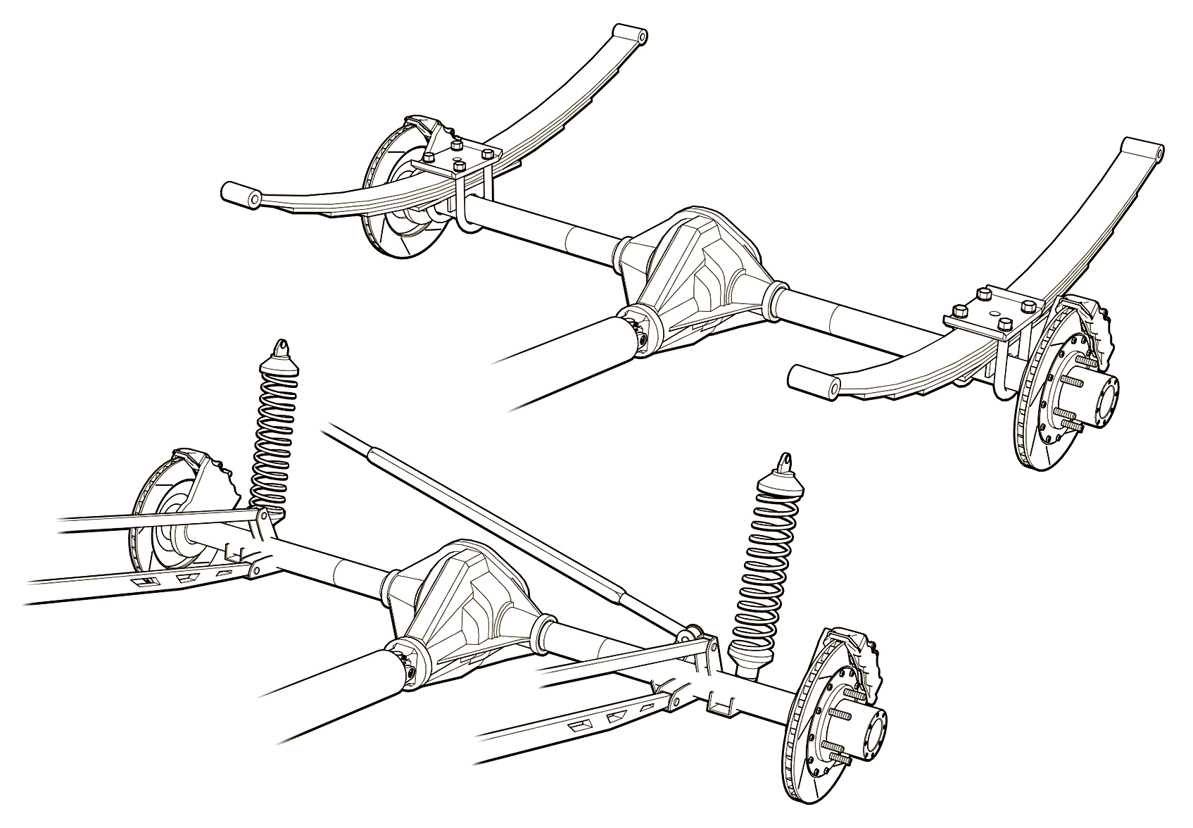 Greg used a three weight treatment on this Raptor suspension illustrations for Car and Driver magazine.
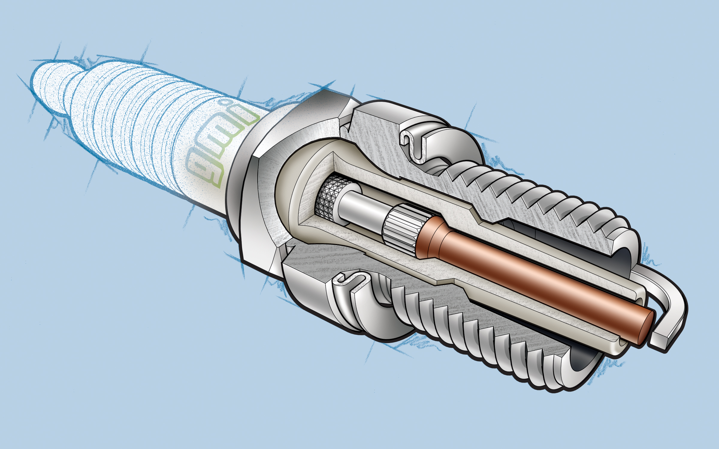 One more piece by Greg Maxson shows his skill at technical illustration using a variety of software, often including SketchUp, Illustrator, and others. Here he adds clarity to the subject with varied line weights, line colors, sometimes sketchy line treatments, and meaningful shading and textures in filled areas.
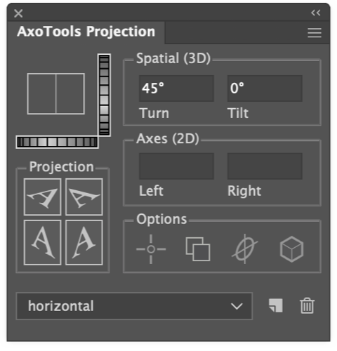
 An isometric grid is one of the most commonly asked-for features in AxoTools, as well as a frequent topic on the Adobe Illustrator user forum. It would be really nice if Adobe Illustrator’s Perspective Grid presets included Isometric, but that’s not an option right now. In the meantime, there are some easy alternatives.
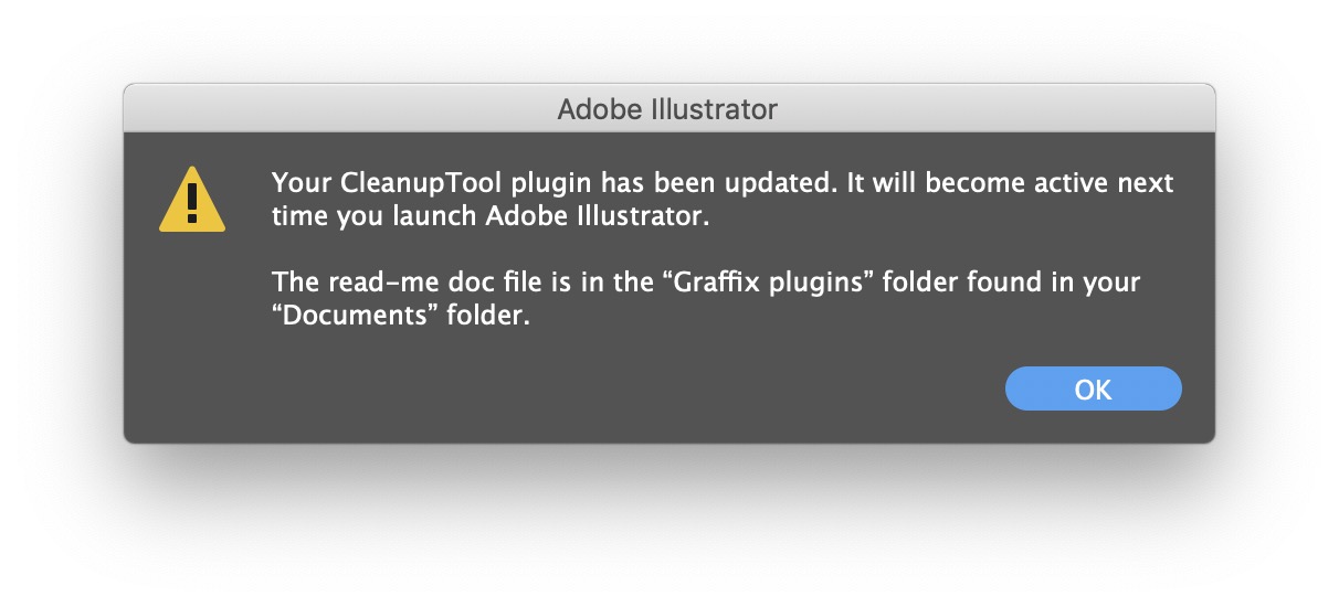 On the other hand, I realize that unzipping the download, then navigating through the file system to place the plugin in Illustrator’s Plug-ins folder is a hassle. Illustrators have too much to do to be saddled with busywork like this!

