Tag72a adds user scripts for document events
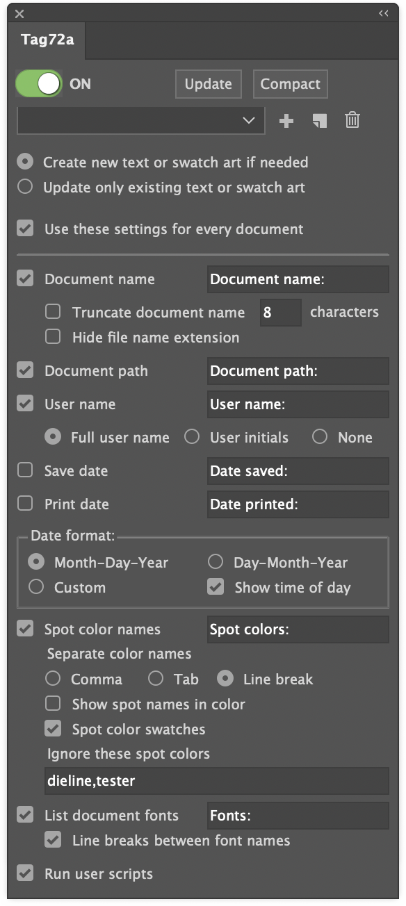
It seems that everyone running Tag72a needs something unique in their document information reporting. The settings panel has grown considerably trying to address as many user requests as possible, but along with flexibility comes the appearance of complexity!
One more preference has now been added, however, that should serve the purpose of countless additional items: the option to automatically run user scripts along with its own updates.
Why would you want to run a custom script? Well, for example:
- Reformat a date to any of the many alternatives to the two formats in Tag72a.
- Parse a filename to derive additional information such as version, language, region.
- Re-order the spot color list so that certain colors are always shown first.
Simply check the “Run user scripts” option and Tag72a will look for and run any found scripts by these names.
- Tag72a_doc_opened
- Tag72a_doc_changed
- Tag72a_doc_print
- Tag72a_doc_save
- Tag72a_doc_save_copy_as
- Tag72a_update
- Tag72a_every_event
You only need to use the script (or scripts) that are relevant to you. Some things to keep in mind are:
- Doc Changed event happens every time a user switches from one document to another, including when a new document is opened or sometimes when a document is closed. You may not want to use both Doc Opened and Doc Changed events if one or the other does what you want. If both Doc Opened and Doc Changed run, it is not a bug, because Adobe Illustrator signals to the plugin that both events took place.
- Doc Print and Doc Save happen just before the actual save or print takes place.
- Doc Save Copy As happens just after you have saved a copy as, which enables the data to be updated from the saved version back to the currently-open version.
- Update happens only when you click the Update button in the panel.
- Every Event happens right after any of the other scripts runs, and works for all events regardless of what other scripts are there. You may want to put some scripting in Every Event and other scripting in specific events, depending on your needs.
- All scripts run after Tag72a makes its own updates.
- Your scripts may need to check the contents of the document to determine whether the script needs to run, because another event may have just run the script. Then again, it may not hurt anything if your script happens to run twice.
You can use either AppleScript or JavaScript. The plugin will run whichever version of the script Adobe Illustrator added to its Scripts menu.
If you write a custom script for one or more of these events, please share your idea with other users!
![]()

 Using a single line weight (or “stroke width” as it applies to Illustrator’s path art property) is a simple and efficient way to work.
 Here’s an example of an illustration I did using the “Kalmbach” method, drawn in ink at 1.5 times reproduction size. Detail lines were drawn with a 4×0 Rapidograph pen, and the heavy lines were probably a no. 0 or 1 pen. In those days, we typically cut an Amberlith overlay to add a flat tint to the background, which helped separate the subject from the background.
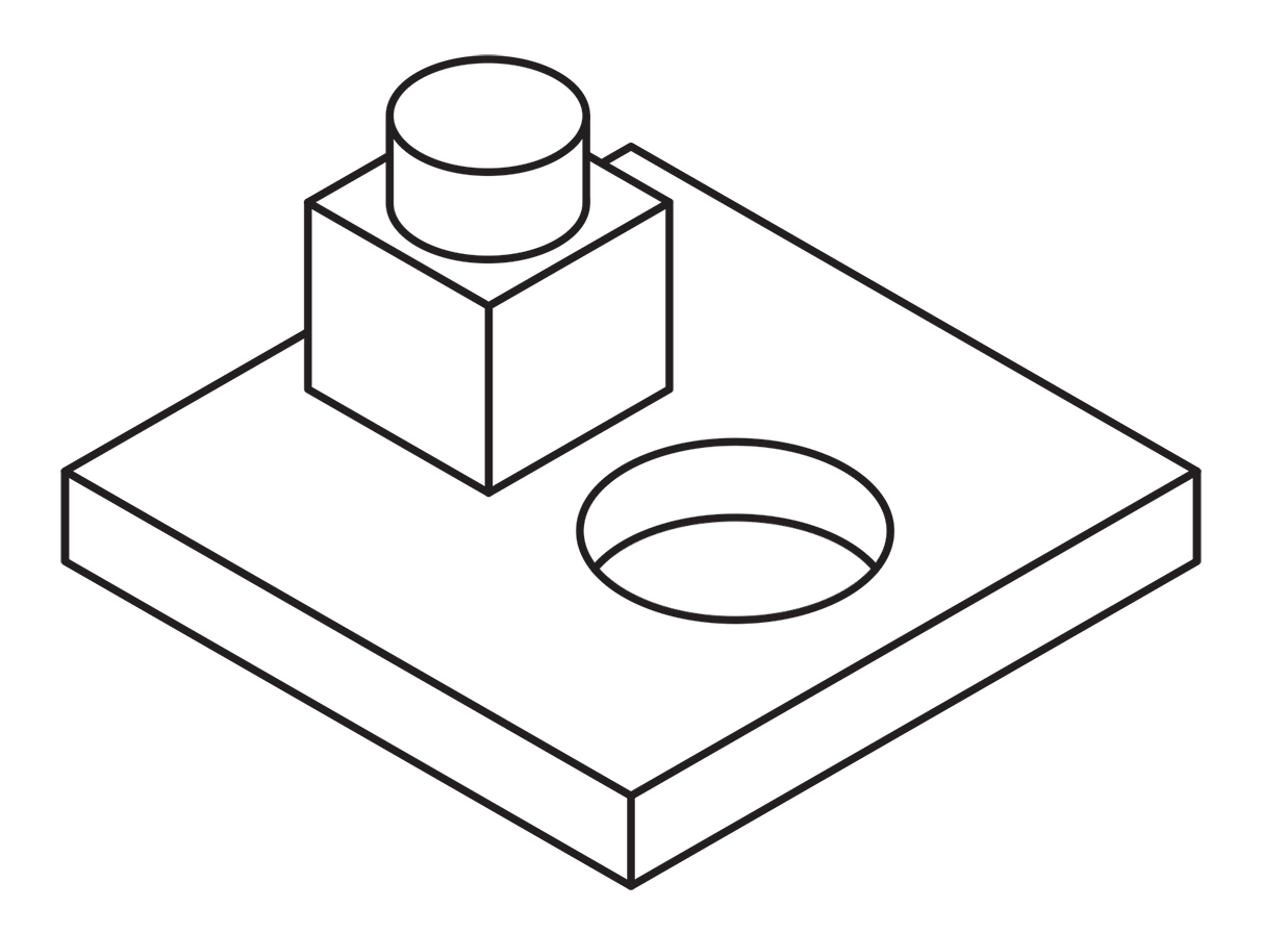
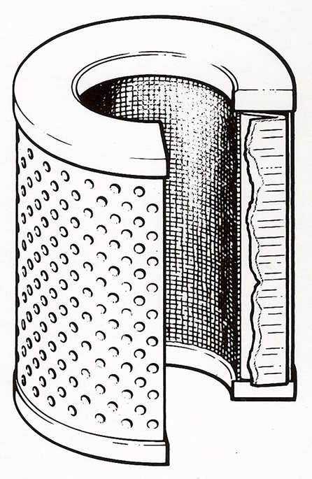
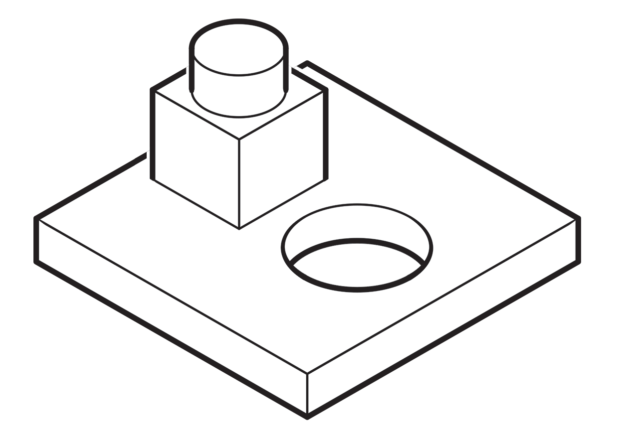 A more common method called “line contrast shading” used in exploded-view parts drawings uses heavier lines on all outside edges of objects. In this example, the bottom of the cube and cylinder are thin lines because they represent the joint between two surfaces. A heavy line would suggest the objects float above the other art. In the case of the round hole, a varied line width makes a smooth transition between the front- and rear-facing edges. Complex illustrations can use three or four line weights. Standards are more like guidelines, actually, that vary between people and between businesses, often based largely on the personal preference of someone with experience and/or influence.
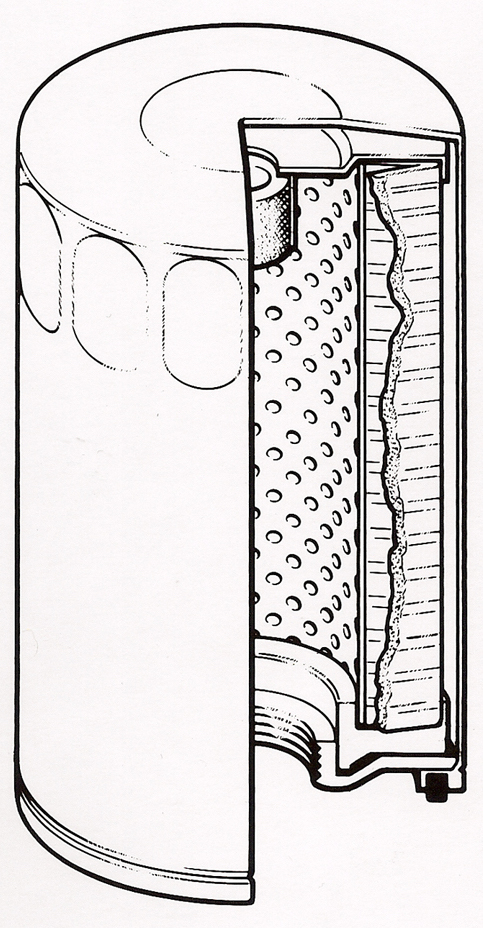
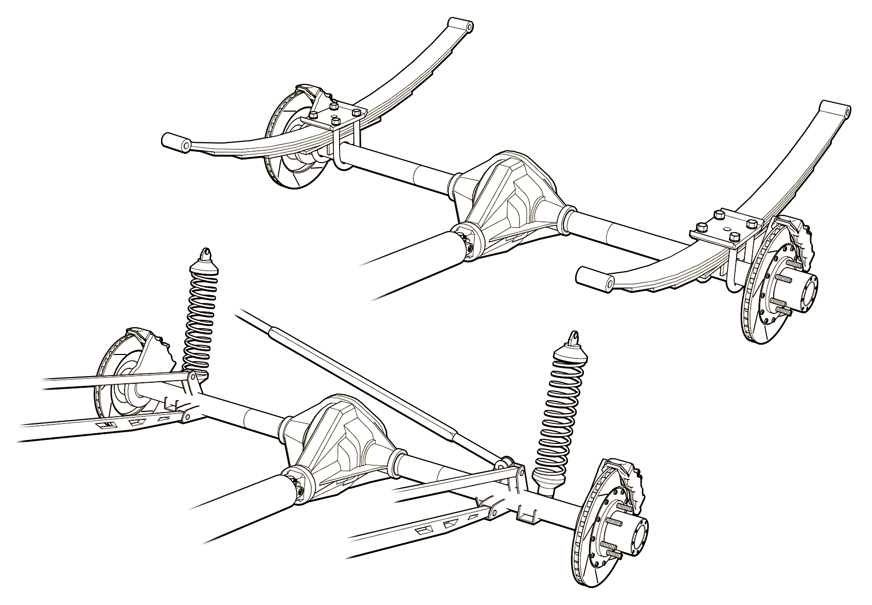 Greg used a three weight treatment on this Raptor suspension illustrations for Car and Driver magazine.
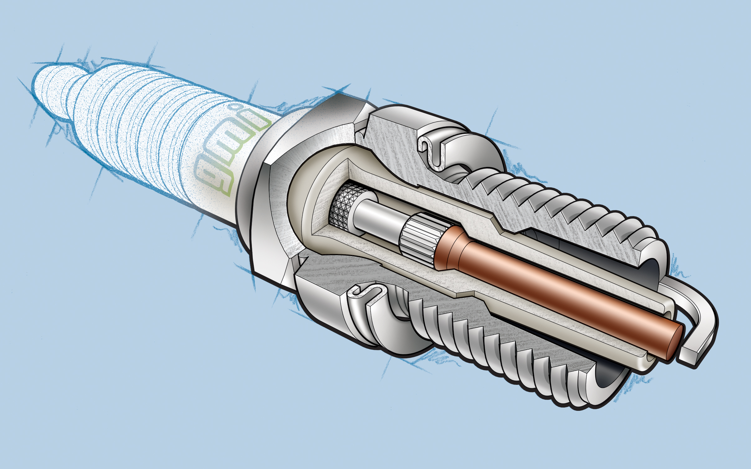 One more piece by Greg Maxson shows his skill at technical illustration using a variety of software, often including SketchUp, Illustrator, and others. Here he adds clarity to the subject with varied line weights, line colors, sometimes sketchy line treatments, and meaningful shading and textures in filled areas.