The newest (free) update to ToolShed plugin for Adobe Illustrator adds menu items for isolation, which enables you to isolate items such as text objects that otherwise cannot be isolated, and you can even enter isolation mode with nothing selected to begin work in a new blank isolated space. In addition, you can now assign keyboard shortcuts to navigate isolation mode, and even record these steps in Actions.
Object > Isolate
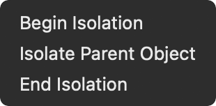
Begin Isolation: With nothing selected, Illustrator will enter isolation mode at the top level of the current layer, ready for you to paste or create new art. With an object selected, Illustrator will enter isolation mode as usual, except that if the object type cannot be isolated by Adobe Illustrator, it will be placed into a temporary folder and that folder will be isolated. Note: Only one item at a time can be isolated, so if you select multiple objects to isolate, only one of them will be chosen to isolate.
Isolate Parent Object: If the item you have isolated is part of a group, this will isolate the group that contains the currently isolated art.
End Isolation: This works exactly the same as the native Illustrator counterpart, but is included here to allow you to assign a keyboard shortcut or include it in an Action.
When recording Actions, use Insert Menu Item to include these functions.
These new menu items are FREE, no activation required.
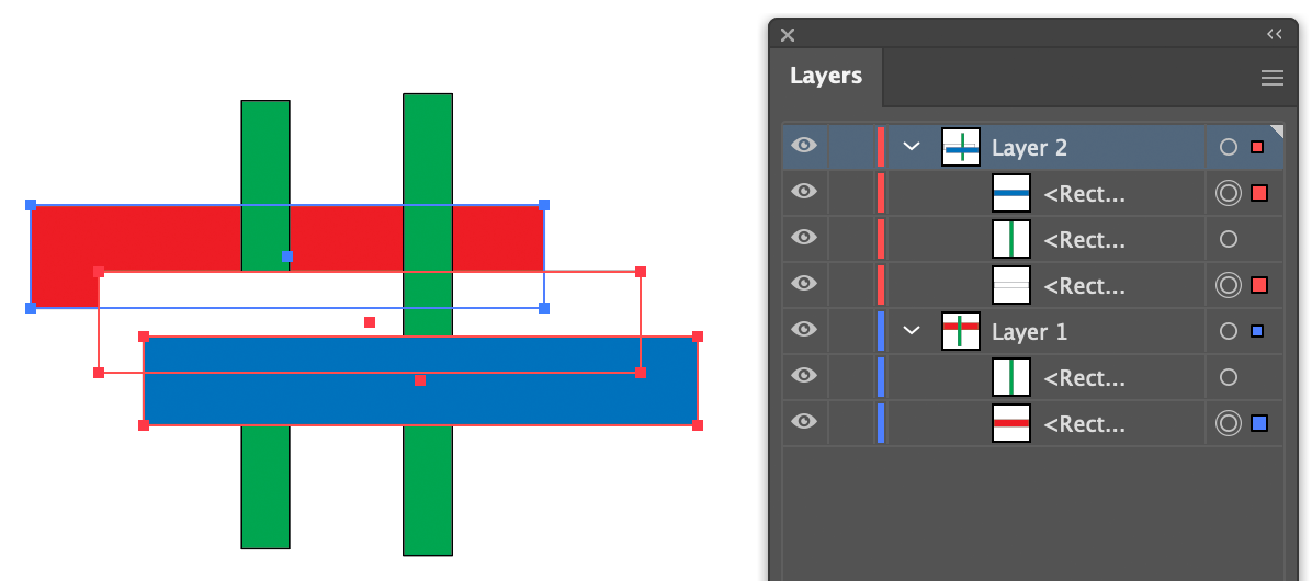
Changing the stacking order of objects has been addressed in ToolShed’s free menu items to arrange them by location or size, but many people simply wanted to reverse the order in which objects were layered. They also wanted to preserve the objects’ original locations across different layers and with other art objects between them. ToolShed’s new Reverse Stacking Order menu item provides that in this new free function.
Object > Arrange > Stacking Order> Reverse Stacking Order
ToolShed contains a few tools that require activation to continue to work after the trial period, but like most of the functions in ToolShed, this menu item is entirely FREE. You can download it now for Mac and Windows, CC 2019 through 2023.
ToolShed has added three new items, all of which are FREE.
Replace with Top Object
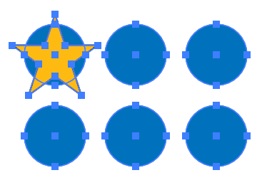
The first new item is a function to replace selected art with a different art object. For example, say you have six blue circles that you want to replace with gold stars. Make sure that the star is the topmost object, located above the others in the layer panel.
Select the menu item Object > Replace with Top Object. The blue circles will be replaced with gold stars, like this:
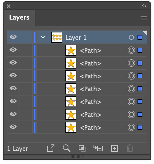
Here you see six stars, but in the Layers panel, there are seven. What’s up with that?
The star was identified as the reference art, and the six circles below it became target art. Each target object was replaced, so you now have a duplicate star under the original reference art. Your reference art could be something used in some other part of your illustration, so this behavior is often useful. This time, however, press Alt or Option as you select the menu item, and the reference art will be deleted after all substitutions have been made. The new art will be positioned centered over the target art.
This menu item is FREE, no activation required.
Bust Up Paragraphs
We quite often have a text file with a list of callouts or labels to add to an illustration. We can re-type them in Illustrator, copy and paste each item one at a time, or paste the text into Illustrator and run a script to separate each line into individual point text objects. I wrote an AppleScript for this about 30 years ago (really) and later made an InDesign version for my colleagues doing page design. I’m guessing it’s probably not too soon 😉 to incorporate this into a plugin menu item. If you select one or more text objects, either point text or area text, it will divide them into several point text objects which you can then move individually as needed.
Paragraph alignment, paragraph styles, character styles, and character formatting are supported.
This menu item is FREE, no activation required.
Bracket tool
This one could have been called a “Brace” tool, but that could be taken in other ways.
For way too long, I’d made these braces/brackets by separating the four bezier curves of a circle and rearranging them as needed. Now ToolShed has a tool that does essentially that same process. Just select the tool and drag to create it to the size you need.
As you drag, you can hold the Alt/Option key to flip it the opposite direction, and/or Shift to constrain it to the nearest 45° angle. Your curve radius is displayed in the on-screen help text, but you can adjust it dynamically by pressing the Up/Down keys. The increments it uses, in combination with Shift and Alt/Option, can be set in ToolShed’s Preferences. There you can also set the default stroke width for this path, as well as the Radiant and Latitude Lines that ToolShed draws. That dialog can be called in the same menu area as other Illustrator and plugin preferences, or by double-clicking the Bracket tool.
This tool is FREE, no activation required.
You can download the free update to ToolShed now. It’s available for Adobe Illustrator CC 2019 through 2023, for Windows and Mac (Apple processor support for 2022-23).
You may have seen a recent video summarizing methods to use multiple line weights in your illustrations.
It’s probably helpful to go into a bit more detail and show more examples.
Using a single line weight (or “stroke width” as it applies to Illustrator’s path art property) is a simple and efficient way to work.
By using more than one line weight, however, your illustrations can have more interest and suggest form.
One method assumes a light source in the upper left. Here edges facing away from the light are given a heavier weight. This was the standard where I worked at Kalmbach Publishing Co. in the 1970s. My mentors there told me it was adopted from a standard for US Patent Office drawings. It was easy to apply using pen and ink, but when they switched from Rapidograph pen to Adobe Illustrator in the 1990s, they switched to a single line weight. Adobe Illustrator, unfortunately, doesn’t lend itself well to multiple line weights, especially if the path is filled.
Here’s an example of an illustration I did using the “Kalmbach” method, drawn in ink at 1.5 times reproduction size. Detail lines were drawn with a 4×0 Rapidograph pen, and the heavy lines were probably a no. 0 or 1 pen. In those days, we typically cut an Amberlith overlay to add a flat tint to the background, which helped separate the subject from the background.
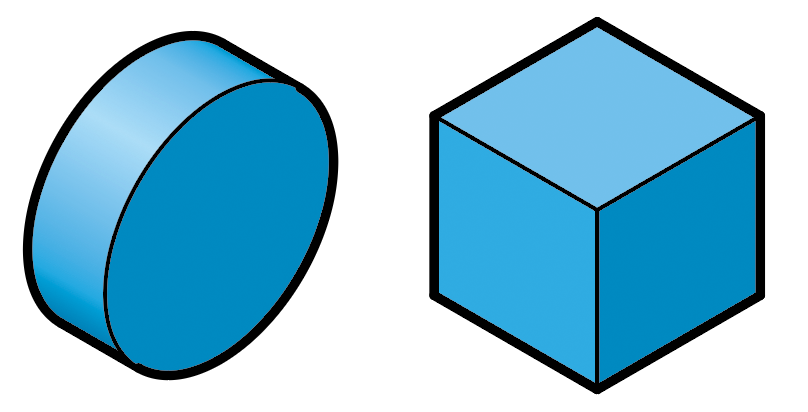
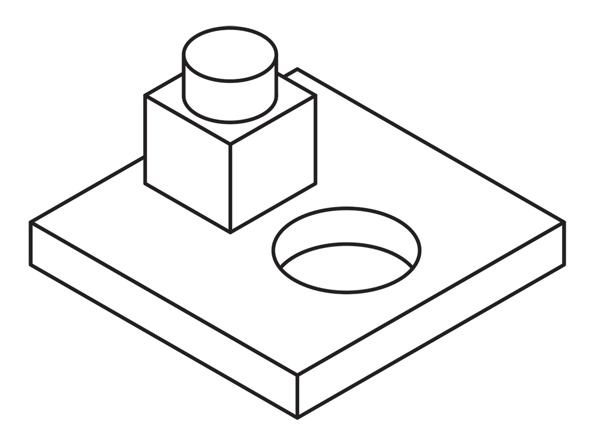
A more common method called “line contrast shading” used in exploded-view parts drawings uses heavier lines on all outside edges of objects. In this example, the bottom of the cube and cylinder are thin lines because they represent the joint between two surfaces. A heavy line would suggest the objects float above the other art. In the case of the round hole, a varied line width makes a smooth transition between the front- and rear-facing edges. Complex illustrations can use three or four line weights. Standards are more like guidelines, actually, that vary between people and between businesses, often based largely on the personal preference of someone with experience and/or influence.
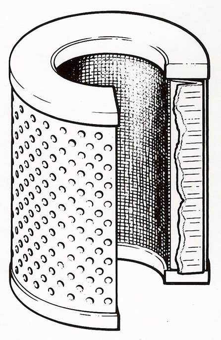
Greg Maxson drew these filter illustrations with pen-and-ink on Mylar for Hyster Co. back in the late 80’s. He explained, “You could really get lost in the detail with pen-and-ink. Lines within an object are thin, exterior object lines are heavier, and exterior object lines that are down and away from the light source are heavier and darker still. The heavying up of the lines down and away from the light source was typically used when illustrating larger equipment, machinery, etc. to give those objects more visual weight. Appropriate for rendering a bulldozer, but less appropriate for rendering the exploded illustration of an ink pen, for example. Of course, super thin interior object lines were/are common when used to represent less than 90 degree radii, and thin broken lines to represent a highlight along an edge, knurling, screening, etc.”
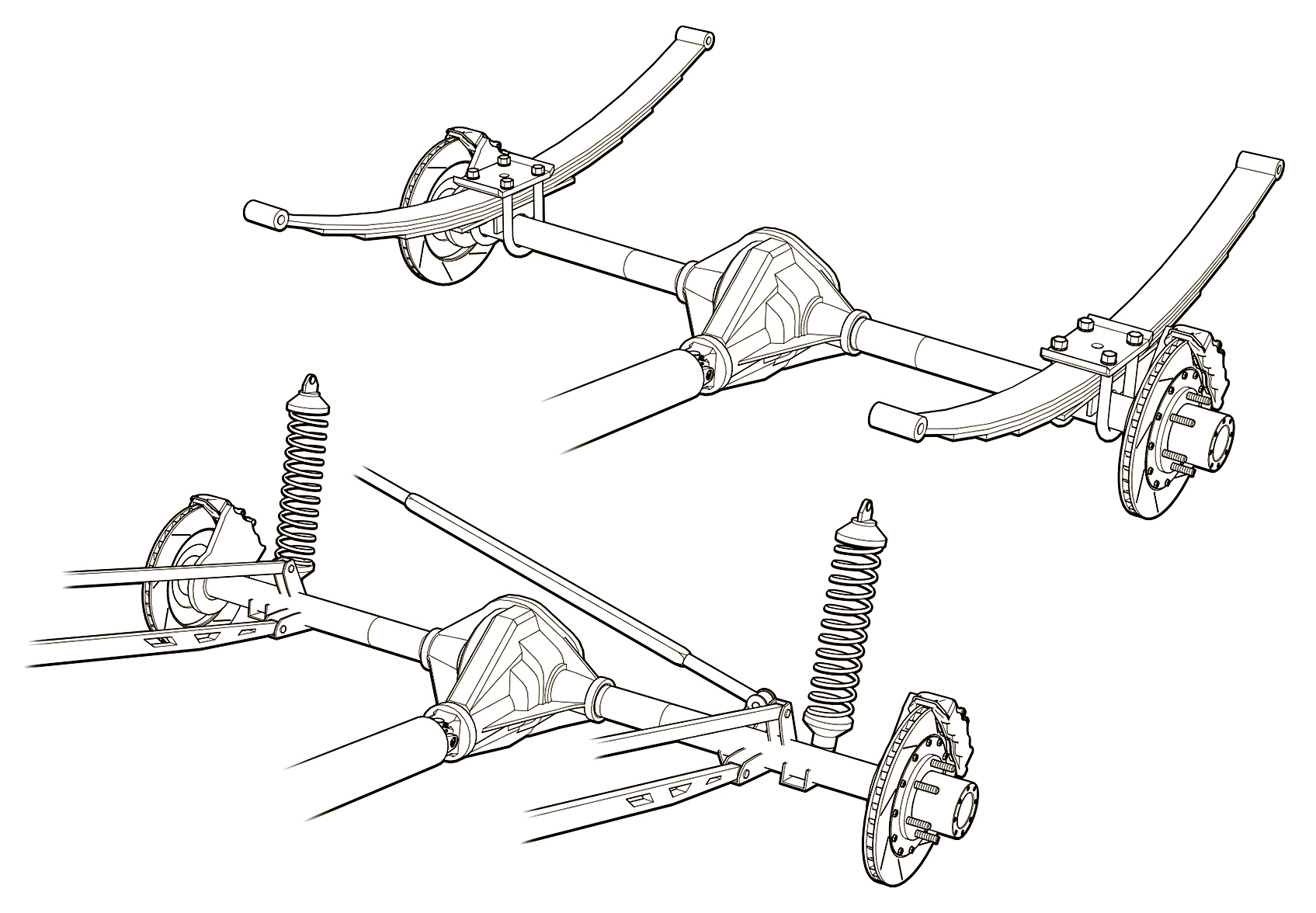
Greg used a three weight treatment on this Raptor suspension illustrations for Car and Driver magazine.
One more piece by Greg Maxson shows his skill at technical illustration using a variety of software, often including SketchUp, Illustrator, and others. Here he adds clarity to the subject with varied line weights, line colors, sometimes sketchy line treatments, and meaningful shading and textures in filled areas.
When AxoTools adds add multiple line weights, it places stroked paths above non-stroked filled paths so weights can change as needed anywhere along the object without affecting the fill. With a simple click of the Axo Line tool, you can toggle weights between thick and thin as necessary. In the coming months, users can expect to see more refinements in AxoTools handling of stroke properties. Please contact me if you have ideas that can make your work faster or easier.
The latest update to AxoTools includes three improvements to shaded fills on extruded art. First, curved paths now have a gradient fill to more accurately show the curvature of the surface.
Second, the lighting is based on the location of a theoretical light source, so surfaces are shaded based on their actual orientation relative to the light, and no longer assigned a simple “top,” “left,” or “right” tint or shade.
Third, the light source is user-definable.
When you extrude a path, its fill color is used as the base color for shading values. For each base color AxoTools uses, it creates a gradient that’s stored in the document’s Swatches panel. To use your own gradient for shade values, just fill your starting object with the gradient and extrude it.
There is also a new panel where you can make adjustments to your light and shading, but it’s important to stress that you don’t ever have to fuss with those controls in order to use the new lighting and shading features. Most of you will probably want to stop reading here and just go download the update!
More for “explorers”
For those other few people in the room who want to take things a notch or two higher, the new panel works in three areas:
Gradient colors
Light location
Lighting properties.
At the top of the panel is a series of five color well widgets that represent the five stops on the shading gradient ramp for your current document color. The gradient itself represents the range of all possible colors to apply to your fills. AxoTools generates a shaded gradient ramp for each fill color you start with when you extrude with the shading option enabled.
The gradient represents the range of possible tints and shades available based on the angle of the lighting. The first gradient stop represents the lightest highlight color where the light hits it at a 90° angle. Using the default settings, the angle of light on the left isometric plane falls very close to the second stop, which is set to the original color. The third stop represents the shade when the light hits an object on its edge, and stops 4 and 5 represent the rear surfaces, with the last stop showing the effect of backlighting.
The light source’s location is defined with the familiar Tilt and Turn adjustments, which are relative to the viewer. Following these are slider controls for the light intensity, ambient light, and amount of backlighting. As you make adjustments to the lighting properties, the color wells along the top of the panel will preview the results of changes to the intensity, ambient, and backlight lighting properties.
At the bottom right, the “Reset to defaults” button will restore the default settings for all slider controls.
Below the color wells are two buttons relating directly to them. The “Rebuild gradient” button will generate five shades of the current document color.
The “Save gradient” button, I’ll confess, was included for the true “explorers.” If you changed the colors in the color well controls, either by changing lighting properties or using the color pickers in the color wells, this will overwrite the gradient ramp used for the base color.
Please see the online documentation for more information.
The process of doing isometric/axonometric drawings in Adobe Illustrator really hasn’t changed much since the mid 1990s, or even since the late 1980s, something I hadn’t fully realized until doing the first AxoTools video. How many of you can relate to this?
Working in Illustrator 88, I would project art to isometric by manually doing the scale-rotate-scale method. When the QuicKeys keyboard macro utility came out, it automated that process and also allowed me to change the constrain angle by pressing an otherwise-unused function key.
In 1994, when Illustrator 5 added support for plugins, I wrote one called Isometric that I shared free on my web site. It added menu items to project art to and from isometric planes, and to create box and cylinder primitives. Does anybody recall using this? I also wrote a free companion plugin Isometric Line Tool to draw straight lines in isometric, which was around quite a while and later merged into AxoTools.
In 1998, Illustrator 8 added recordable Actions, which was easier to maintain than updating the plugin as Illustrator’s API became more complicated. It also added Smart Guides, which I relied on when QuicKeys had compatibility issues with operating system changes.
About this time, Adobe had a simple 3D app called Dimensions (not the same as their current Dimensions product) that exported shapes to a file Illustrator could open. This app was the origin of the “Off Axis” projections I use in my Actions and in the current AxoTools presets. I used Dimensions in my first locomotive cutaway rendering. Unfortunately, it didn’t last long. Some of you may use SketchUp in that same way today.
Has anybody found Illustrator CS’s 3D effect actually useful for scale isometric drawings? I had high hopes when it appeared, but it never proved truly useful to me.
Hot Door’s CADtools has had support for isometric for several versions now, and in recent years supports axonometric views. I’ve found CADtools indispensable for technical drawing, but knew there had to be an easier way to assemble the pieces.
So for over 30 years, the process has been to project a shape to an isometric plane, then manually move it into position. This worked OK when one plane served as a sort of floor plan that other shapes could be snapped to, but it didn’t work well for most things I drew, like vehicles, machinery, and electronics. In order to get objects positioned correctly, I often drew a temporary “armature” with projected lines along two or three axes.
I’d actually envisioned today’s AxoTools plugin decades ago, using virtual armatures to position art and tools with custom constraints to move art along any defined axis. Using geometric formulas by Ron Kempke, it became possible to add support for any axonometric projection showing the left, right, and top views. Why it took so long, I’m sorry I can’t answer. I hope you agree that doing axonometric drawing in Adobe Illustrator is significantly easier than ever with AxoTools.
 The newest (free) update to ToolShed plugin for Adobe Illustrator adds menu items for isolation, which enables you to isolate items such as text objects that otherwise cannot be isolated, and you can even enter isolation mode with nothing selected to begin work in a new blank isolated space. In addition, you can now assign keyboard shortcuts to navigate isolation mode, and even record these steps in Actions.
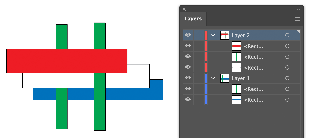


 Using a single line weight (or “stroke width” as it applies to Illustrator’s path art property) is a simple and efficient way to work.
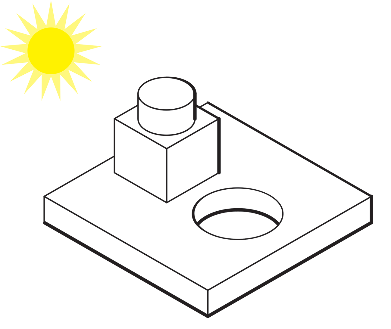
 Here’s an example of an illustration I did using the “Kalmbach” method, drawn in ink at 1.5 times reproduction size. Detail lines were drawn with a 4×0 Rapidograph pen, and the heavy lines were probably a no. 0 or 1 pen. In those days, we typically cut an Amberlith overlay to add a flat tint to the background, which helped separate the subject from the background.
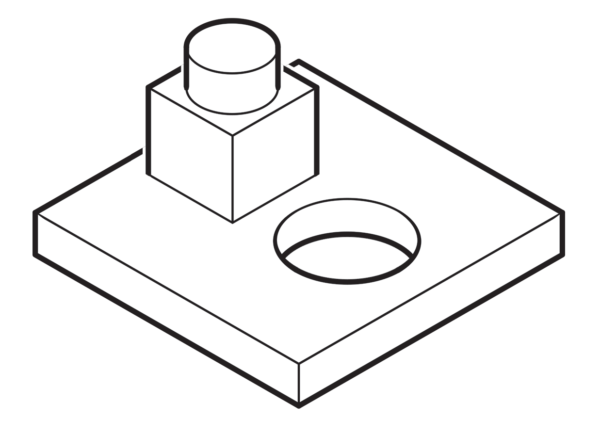 A more common method called “line contrast shading” used in exploded-view parts drawings uses heavier lines on all outside edges of objects. In this example, the bottom of the cube and cylinder are thin lines because they represent the joint between two surfaces. A heavy line would suggest the objects float above the other art. In the case of the round hole, a varied line width makes a smooth transition between the front- and rear-facing edges. Complex illustrations can use three or four line weights. Standards are more like guidelines, actually, that vary between people and between businesses, often based largely on the personal preference of someone with experience and/or influence.
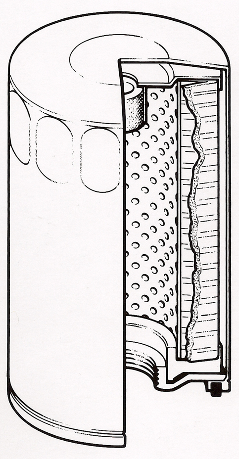
 Greg used a three weight treatment on this Raptor suspension illustrations for Car and Driver magazine.
 One more piece by Greg Maxson shows his skill at technical illustration using a variety of software, often including SketchUp, Illustrator, and others. Here he adds clarity to the subject with varied line weights, line colors, sometimes sketchy line treatments, and meaningful shading and textures in filled areas.