Square Up plugin for CC now available
If you’re familiar with the Square Up plugin, you may happy to know that it’s now available for Illustrator CS6 through CC 2017.
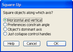
 Have you ever been given a project with almost-usable art to use as a starting point? You know, the kind where straight lines should be at right angles, but it’s just a little bit cockeyed? I used to manually snap every point to a grid, but thought “good grief, there must be a simpler way.” That’s when I got the idea for Square Up. With it, you can just select the paths you want to straighten, select how you want them aligned, and “click” it’s done. There are four methods of squaring which could probably benefit from a brief explanation.
- Horizontal and vertical: OK, this one may be self-explanatory, but I’ll elaborate anyway. The plugin first collapses all control handles so that any organic shape will become a polygon or polyline. It then measures the angle of each segment, and if it’s roughly vertical, the horizontal position of the endpoints are averaged so that it becomes true vertical, with similar treatment of horizontal segments. If it’s somewhere around 45 degrees, it just leaves it.
- Preferences constrain angle: This one works similar to the first option, but aligns segments either parallel or perpendicular to whatever you set your constrain angle to in Illustrator’s preferences.
- Object’s dominant axis: This is my favorite. I found that as I use Illustrator’s Free Transform tool to resize and rotate a rectangular object, like the outline of a structure on a map or architectural plan, the object gradually degrades to something resembling a parallelogram. The plugin measures all of the segments’ angles and averages them, then uses that as a major axis to align with. It even works on a group of objects that need to be rotated to the same angle.
- Just collapse control handles: Because sometimes all we want is to sharpen the corners.
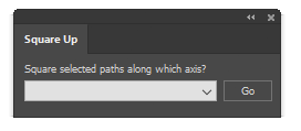
 I might mention that the plugin now comes in a new, compact size. At first I made a panel that mimicked the dialog shown here, then realized it didn’t have to be that huge. Even though panels (remember when we called them palettes?) have some real advantages over modal dialog boxes, there is a point where they begin to crowd our work area so I promise not to make mine larger than they really have to be.
Please feel free to try it out!
![]()
